/r/photoclass2023


/r/photoclass2023
2,212 Subscribers
Future Photoclasses
Hi photoclass,
It's with some pride I can say photoclass is continueing in the future!
u/clondon has taken it upon herself to teach the next classes and will do so at the original sub r/photoclass .
I wish her all the best and hope she gets as much reward from it as I did these last ten years.
Aeri
09:43 UTC
41 - How to go further
I’m afraid that this course has come to an end. We have covered everything that I would consider important for a newcomer in the field of photography to know. This is not to say that there is nothing left to learn, quite the opposite in fact. The question is: what now?
Assuming you have read, understood and practised all the lessons, including the assignments when they exist, I see three possible paths:
- You can consolidate your newly-acquired knowledge. Stop learning new stuff for a while and focus on mastering what you already know until it becomes second nature.
- You can dive deeper into the topics we covered. In many cases, for instance post-processing, we only scratched the surface of what is possible. Exceptions to the rules, subtleties and other tricky cases were often omitted for the sake of brevity and clarity. You can choose to study any of these points in more details until you become an expert.
- Finally, you can choose to expand your learning in new domains. There is a lot we haven’t covered, for instance panorama, HDR, night photography, camera movements, black and white, infrared, fisheye, underwater, etc. Follow your interests or try something completely new, experiment, it’s a vast world.
The good thing, of course, is that these options are not mutually exclusive. Whatever you end up choosing, I would urge you to spend time consolidating. At least 6 months, possibly more: it’s all fine and well to read about stuff in a book or on reddit, and even to try it out a few times, but until you have shot thousands of frames, it won’t really be part of you.
Which leaves the question of how. Listed in rough order of efficiency, here are some suggestions:
- Shoot! Nothing can replace this. If you want to be good at taking pictures, you need to practice. A lot. All the time. Some people like self-assigned projects, others just shoot things as they come. Whatever works for you, be sure to close the books, leave your keyboard and go shooting.
- Consider taking a workshop or a course. When they are well run, they are the fastest way to learn and can often give you an inspiration jolt. If you take one from a famous photographer, try to find online reviews from past participants first, as being a good photographer does not necessarily equate being a good teacher.
- Interact with other photographers, either in real life or via online communities. Share your work, get feedback and exercise your critical eye by giving feedback to others. Just make sure you don’t end up chasing the warm feeling of having people tell you you are great instead of striving to create better images. Also try not to be sucked in the endless gear discussions vortex that is sadly so common on many internet boards. People who spend their time there are usually the ones who don’t shoot very much.
Some good places to start are flickr, 1x, naturescapes and photo.net but there are many, many, many others. Just find a friendly, not too gear obsessed place.
- Read books on your favourite subject. Three publishers I can warmly recommend for their great quality (disclaimer: I am an author at two of them, but this is because I like them, not the other way around) are Craft and Vision, Rocky Nook and Peachpit. There are too many titles to mention here, but some books that have inspired me include Joe McNally’s The Moment It Clicks and The Hot Shoe Diaries, David Ward’s Landscape Within, Galen Rowell’s Inner Game of Outdoor Photography and the textbook Light Science and Magic.
Oh, and did I mention you should go out shooting?
I hope you enjoyed this course and learned a few things along the way. I really hope I managed to convince you that photography can be both simple and fun.
So we end it, after ten years of teaching photoclass I've payed my part forward and now it's up to you... If you choose to go on with photography, look out for chances to mentor, to teach,, to share the love of this art to the next generation of photographers.
As a final assignment, I would love for you guys and girls to show your photo's you've made during these classes. Show the funny ones, the failed ones, the ones you liked best...
assignment:
https://old.reddit.com/r/photoclass2023/comments/15izpcj/assignment_41_a_tree/?
16:15 UTC
Assignment 41 - a tree
Hi photoclass
our journy is at the end and it's time to put it all together and make the best photo you can, you pick the subject :-)
16:14 UTC
40 - Share your work
We have almost reached the end of this course (one more lesson next week) and we have covered a lot of ground, but there is an important aspect of photography we haven’t yet discussed: once you have created all these (hopefully wonderful) images, what do you do with them?
Except for a few zen monks who are happy to create art and destroy it as soon as it’s finished, photographers want their work to be shared with the world and appreciated by others. For many, it is even why they decide to pick up a camera in the first place.
Sharing your work is also one of the most powerful learning tools out there. Not really because you get insightful criticism (though it does happen, it remains the exception more than the rule) but simply because it pushes you to give the best you can and makes you strive to get even better.
It is all to easy to have thousands of images lying in a dusty corner of a hard drive. To be honest, post-processing is often a bit of a dull job, and people often procrastinate it until a new photo session has replaced the old one. Before your realize it, you have a huge backlog of unprocessed images. Knowing that your work will be seen by others is a great motivation to process them and get them out there.
The good news is that with the internet, it has become extremely easy to share your images with the world. There are many online communities dedicated to just that, and of course photo hosting services like flickr . It is also possible to host your own website with great simplicity, using tools like pixelpost or even wordpress.
All of these solutions allow viewers to comment on your images. Of course, getting feedback is great, but this can also be a dangerous thing. Not everybody is an art critic or even a photographer, so any advice should be taken with healthy circumspection. Raving compliments such as the ones often found on flickr, while certainly nice for the ego, bring little and can give you the impression that your work is perfect and that you don’t need to improve it, a very dangerous attitude.
Another danger is the one of trends. If you are actively looking for positive comments, the easiest way is to follow whatever is hot at the moment: HDR, timelapse, faux-polaroid, vignetting effect, etc. More generally, it can be tempting to use a certain style or subject matter simply to better fit in in your community. The ultimate result is that your images will become generic and undistinguishable from the ones of the next guy.
This brings us to the second point of this lesson: while sharing your work is very important, you need to find a balance as to how much you let external criticism influence you. Not at all, and unless you are an art genius, you will keep repeating the same mistakes over and over without any way of getting out. If on the other hand you follow every advice given to you, you will add nothing personal to your images and will simply produce whatever the hivemind has decided it wanted this week.
The way of the artist is a difficult one – you must accept and listen to honest criticism while standing up for your work. Shoot for yourself, but share your art with the world.
the assignment: https://old.reddit.com/r/photoclass2023/comments/15evj13/assignment_40_share_your_work/?
23:25 UTC
Assignment 40 - Share your work
class: https://old.reddit.com/r/photoclass2023/comments/15evjf7/40_share_your_work/?
For this assignment, I want you to make a portfolio.
Create a folder on imgur, or flicker, or make your own website using one of the free services...
The portfolio must contain between 15 and 20 photos. NO MORE.
in the future, to add a photo to your portfolio, you will have to delete one of the others... keeping the quality high. Setting a high standard.
23:24 UTC
39 - Be inspired
While it is certainly true that there is no recipe for good photography, it should also be said that most great images share a common ingredient. More than luck, raw talent, hard work, experience or equipment, what really made a difference was that the photographer deeply cared about the image. The creator of the piece had something to say, and photography was how he chose to express it. It may not have been the immediate subject that the artist really cared about (I doubt Edward Weston was that passionate about peppers), but, at some level, there is a message in each of those timeless photographs. In a way, this is almost a tautology: a good photograph is one that is inspiring, and it can’t be inspiring to viewers if it hadn’t been to the photographer when he pressed the shutter. If you want to create powerful images, the first and most important step is simply to care. You need to have something to say, and you need to try and express it through your photography.
Every time you are about to take a picture, ask yourself how the scene you are photographing makes you feel, and whether the image you are about to create is the best way to express that feeling. Are you awed, amused, scared? Is this a tale of suffering, of conquest, of brotherhood, of humility?
Just remember this: if you don’t care about your subject, why should any viewer? And deeper even, if you don’t care about your subject, why would you care about producing a good photograph of it?
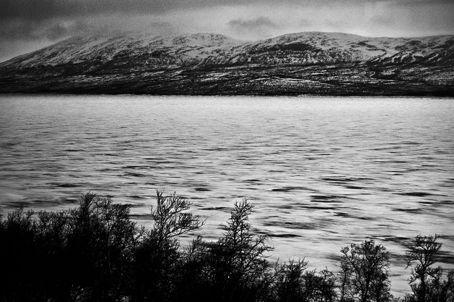
To illustrate this, here’s a personal story. A few years ago, on a hike in Swedish Lapland, I saw a postcard with a waterfall in front of an easily recognizable mountain. As I walked back to camp, I happened to pass that very waterfall in similar lighting conditions. For some reason, I felt that I had to take the same picture. It turned out pretty well, and has had some success with viewers, but deep down, I have always hated it. It wasn’t mine, I wasn’t expressing anything with it. I have since deleted it from my portfolio and am not showing it anymore.
So look into your soul. Find something that you care about, something that you want to share, something that makes you want to take your camera, your paintbrush or your pen and pursue it.
I don’t like cars very much, and I have little interest in them. I find car photography rather boring, and I have no doubt that if I were to try and photograph cars, I would come back with poor images. Maybe they would be well exposed and well composed, but they would not stir anything in the viewers, simply because the subjects didn’t stir anything in me.
On the other hand, climbing, especially in the big mountains, is my life. I have so much to say, so much to share about that wonderful experience that climbing a mountain is. And even when my pictures are badly exposed or blurry, they usually still have more soul than any photograph of a car I could ever take. And of course, to many people, mountaineering photos will look dull while anything with four wheels will make them salivate. This is fine (though they are wrong, but hey… ;) ).
The recipe is simple: photograph what you love.
10:33 UTC
Assignment 39 - Be inspired
as always, please read the main class first
For this assignment, I would like you to show what YOU are passionate about, and try to make us viewers share that passion, feel it in your photo. IT can be a sport, hobby, nature, philosophy, music, .... just not a person or a pet as that would make it a simple portrait
This is a harder one than you'll think as it's not about making a technically correct photo but about invoking a feeling, an emotion in the viewer, so take your time, think about what you want to show, how you'll show it and plan the photo.
10:33 UTC
Assignment 38 - Exporting
Please read the main class first
Select a photo and create these versions of it on your hard drive.
On your desktop, in a folder called photoclass, save a jpg-image that is 900px big on the longest side with your own watermark in the upper right corner in black or white letters
In that same folder save a full size photo for use in photoshop and call that photo photoshop-001
now select five foto's and save those in a second folder on the desktop called photoclass-collection. Make those smaller than 800Kb and at least 2048Px on the long side. these will be printed on matt paper so sharpen them first, no watermark on this photo.
Now create your own preset(s) to automate exporting photos for photoclass in future lessons.
You don't have to show the photo's here, or the folders, if you can do it I'm happy, if you don't succeed, please ask questions so we can help you :)
08:02 UTC
38 - Exporting
Over the last few classes we've imported photos, organized them, selected them and edited them.
But in all that time, your computer has not changed the raw file. This would be different if you would edit a photo in photoshop, or saved your photo as a jpg, but the raw files do not get changed.
Lightroom (or other editors) create a second (XML) file with the changes you make and so the work you did was never invasive, or definite. You can always go back.
The problem this creates is that when you would send your raw file to a second person, your edits are not.
So, the last step in the process of editing photos, is exporting them.
Exporting
Exporting a photo is telling the program to create a copy of the raw file, adapt the changes you made to it and create a jpg, gif, png or other graphic format file.
- The first step to export is to select one or more (shift or ctrl click) files.
- Click File - Export... (ctrl shift E)
under A you see presets. these are saved sets of settings. use these! to create a new one, after you set everything like you want it, click Add and give it a name. you can not edit them, so to change one just rename and delete the old.
1 is the first thing to change. you can export to hard drive and make a file, E-mail to open the default mail editor, CD/DVD to open the writer and external services. I can export to my webshop for example, or an FTP-service, or... well, you get it
Now to the details:
Export location is all about where the file will end up. Select the main folder for your photos, select put in subfolder and create a new one every time... this is the best way to work when all your photos have to end up in the same basic folder.
File naming is about renaming the photo. you can use automated extentions, numbering and so on.
Below that is Video, not part of this class.
1 : you can export to different file types.
JPG: small and most used psd: photoshop file TIFF : big file, no compression, save layers, best quality DNG: raw file with saved settings included
the 'limit file size to' has to be taken with a grain of salt. if you set it too small it will at times go over it, and/or refuse to export.
2: allows you to change the size of your photo. I set this to "long edge" at all times, the crop tool is easier to keep the dimensions I need. resolution: leave blank to keep the original, 180 for most print services, 72 for internet photos.
3 : you can sharpen photo's here
4 : Watermarking allows you to add a watermark (text or image) on every photo. Create your own there and save it for later reuse :-)
Last step is to click Export and let the program do it's thing.
Some things can look different in other programs than lightroom but in general you'll have to find the same options in all of them so this class isn't just for lightroom users. if you can't find it, just open the manual or find a youtube video about it :-)
08:02 UTC
37 - Levels and curves
In this lesson, we will discuss what is, by far, the most important and powerful tool you can use to post-process an image: curves. With it alone, you can do maybe 50% of all your editing. Throw in a basic knowledge of layers and masks, which we will talk about tomorrow, and this climbs to something like 80% (disclaimer: these figures were made up on the spot).
Even though curves are relatively straightforward, there is a simplified version of the tool which, while losing some power, is often sufficient: levels.
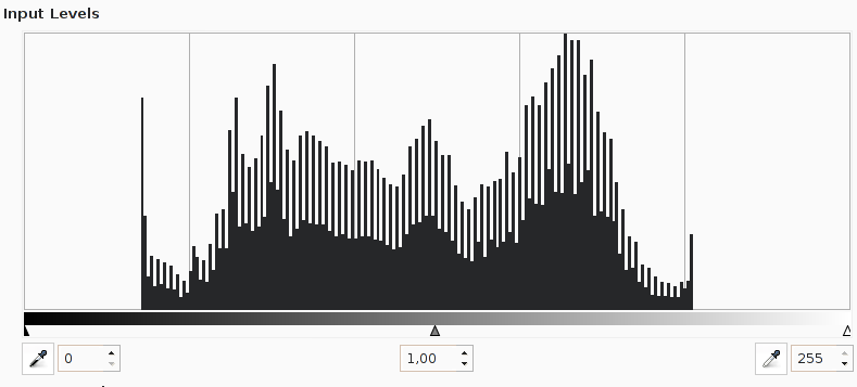
Levels and curves modify exposure and, by extension, contrast. In order to be used effectively, it is crucial to have a good understanding of the histogram.
Let’s talk about levels first. As you may remember, we said in the histogram lesson that a “perfect” histogram is one which has a bell shape, tapering off in both directions and ending exactly at the edges, which correspond to pure white and pure black. You don’t want it to end after the right edge, for instance, because it would mean that you are losing information and getting pure white, and you don’t want it to end before the right edge because it means that there are no really bright values in the image, which will make it appear dull and washed-out, lacking contrast.
If you were careful about your exposure, your histogram should be on the conservative side, to avoid losing details. This means that the histogram is “too small” and doesn’t touch the edges: the image looks a bit dull, without much contrast. In a word, it doesn’t “pop”!
What levels does is resize the box, so that your histogram fits into it perfectly. It looks like on the following image (this comes from the Gimp, but Photoshop or countless other applications will be similar). There are three controls: black, grey and white points. Let’s forget about grey for now and concentrate on black and white. If you slide them around, they will define the new edges of the box in which the histogram lives.
One intuitive way to think about it is the following: imagine that the histogram is a bit spring (or a bit of jelly). When you move the black point to the right, it will be attached to the left edge of your spring. Then when you apply the levels tool, the black point goes back to the left edge where it started, bringing with it the histogram, thus deforming it to fit the box better. Of course, the white point does the same thing on the other side.
Concretely, what you should do 95% of the time is simply to drag the black point to the leftmost part of the histogram which contains something, and the white one to the rightmost part. Once you apply the tool, you will have a perfectly shaped histogram, with just a touch of pure black and pure white, but no lost information.
Starting model in Antwerp park
Ok, but what about the grey point? Its action is simple: it will also deform the histogram, but instead of affecting the edges, it has to do with the balance between highlights and shadows. If you drag it to the right then apply the levels tool, it will also return to its position in the middle, taking with it the histogram. This will compress the shadows and expand the highlights, thus darkening the image. Similarly, shifting it to the left will brighten the image, since it gives more importance to the highlights.
The grey point is very useful for a simple reason: it doesn’t touch the edges. So with it, you can modify the overall brightness of your image without ever having to worry about whether you are losing any information to pure white or pure black.
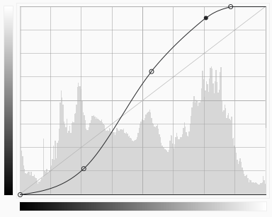
Useful as it may be, the levels tool has two important limitations: it only provides three points of reference (black, grey and white), and it is impossible to control how it deforms the histogram. This makes it suitable for “high level” manipulations, but not for fine-grained ones. This is where curves will be useful. See an example of the interface here:
Like levels, curves will remap brightness values (i.e. they will say “all pixels with brightness 127 should now have brightness 135″ and so on), but they do so much more explicitly. It works in the following way: for each value on the horizontal axis, modify its brightness to the value on the vertical axis to which the curve makes it match. This means that if your curve is a perfect diagonal (what you always start with), there is no modification. If the curve is below the diagonal, you are darkening the image. If it is above the diagonal, you are brightening it.
So far, so good. Where this becomes really interesting is when you are mixing both. A typical curve will have an S shape: the shadows will be darkened and the highlights brightened. In other words, you are increasing contrast. By choosing where the S intersects the diagonal and how deep the bends are, you can very precisely modify contrast and brightness. You can also make modifications to only the brightness values you are interested in while leaving the others untouched. The possibilities are nearly endless.
Another interesting way to use both levels and curves is with the eyedropper tool. In levels, this will allow you to select directly on the image what should be pure white and pure black. In curves, it will do no modification but will simply place a control point on the curve corresponding to the exact brightness of the pixel under the cursor. You then simply have to move the point up or down to modify the brightness of this area of the image.
17:04 UTC
Assignment 37 - Levels and curves
This weeks task is simple but effective.
Re-edit one of the photo's of the last assignment but use the curves and levels to do it.
post both the photo and histograms
17:04 UTC
Weekend assignment 23 - a tree, improved
Hi class,
it's nearing the end of this series, and the last photoclass for me, and so I thought it was time to see what you've all learned...
So, go out and make me a good photo of a tree. use what you've learned and make it the best you can...
post your work in reply of this photo and link also the first tree you made when you started lesson 1... and please,, do not link to imgur albums because they're blocking the use of VPNs. imgur images seem to work
have fun :-)
13:01 UTC
36 - Lightroom 3
I seem to have skipped this one :-) it's supposed to be 39
In part 2 we talked about the basics of editing and the top part of the lightroom development panel. Most work is done there. HSL, split toning and other panels we are going to discuss today are more for artistic editing.
Split Toning
Split toning is giving the highlights different colours than the shadows. It allows you to really change the tone of a photo, give it a filmish look.
To make it work, click the grey boxes besides highlights and shadows and give them both a different colour... remember colour theory for this one, opposite colours work best!
An example with lightroom : http://imgur.com/a/w9GWx
This works best with images that have little colour, or nice contrasts. with a balanced photo it might not have a big effect. to change that, up the hightlights and down the shadows to give your image more contrast
Detail
This is where we will remove noise and bring back detail. ** Sharpening**
Sharpening will make edges 'harder' and make detail stand out. Too much sharpening will create detail that wasn't there (called artefacts) and so create noise or make it worse.
Noise reduction:
Noise reduction will remove noise by removing detail from the image. This has gotten really good the last few years but it still removes detaill so, be gentle with it. you do not have to remove the noise untill you can't see any at 100% zoom, you just have to remove enough to make it not stand out. Even at ISO 6400 I rarely go above 20% noise reduction.
To be honest, I never touch the other sliders, I can see no real difference with any of them. Please contact me if you have a good tutorial or understanding of them.
Lens Corrections
2 ways of using them : with a profile or manual
profile:
select your lens in the list and change the amount untill it looks right to you (lines are straight, colours look good).
This works great so, this is my default. It will correct distortion and vignetting for all my lenses except for manual lenses (old ones)
Manual
with manual corrections you can straighten photos with perspective problems.
- Distortion: change this when the image looks round or pinched
- Vertical: when vertical lines are straight but point in our out
- Horizontal: when horizontal lines are straight but at an angle
- Rotate: rotate the image to make it level
- Scale: same as crop tool
- Lens vignetting: makes the corners brighter or darker. use here only to correct before rotating or cropping, never for artistic effect
Effects:
Here you can add a vignette to your image. slide amount left to make it dark or right to make it bright.
Do not overdo this! it needs to be subtle, almost invisible...
All the way right looks like an antique photo, all the way to the left if perfect for a funural card...
Change the size, roundness and feather with the sliders below.... but remember to keep it subtle....
with the grain slider you can add artificial grane for artistic purposes... slide right to add :-)
There, that was the development pannel. hold on, we're allmost there :-)
23:49 UTC
Assignment 36 - Lightroom 3
Please read the main class first
This is the RAW file for the photo of a dog . I would like you to edit it in 3 different ways..... at least 1 black and white
Rules: If you want to post this photo anywhere outside this reddit photoclass, you must watermark it with Pieter Osaer as photographer AND your name as editor.
23:49 UTC
imgur albums
Hi class,
Imgur is giving me a lot of problems viewing albums but simple images seem to work fine... so please, link each image seperately to avoid this problem... or use an other image provider
tnx
11:40 UTC
35 - Lightroom 2
Develop mode
The develop mode is the place where you will edit the photos. You can edit one by one, or use groups of photos. You can also edit one photo and synchronize (selected) settings to other photos. This is where lightroom shines but other programs allow for this as well.
Although they might have different names, most of the settings I'll explain today can be found in other programs and will work in the same way (more or less) to have the same effect. This is because most of these changes could be done in a darkroom as well so all software programs will have the same names for the same effects.
General workflow
In the lightroom develop mode I tend to work from top to bottom. I am not strict about this however, and will go back to change settings if I think it's what the photo needs. Working from top to bottom generally gives the best results.
Overview
The photo we are going to edit is in the center of your screen. if you have multiple screens you can also put this on a second screen for a bigger view.
On the right of that you'll find the develop toolbar with the histogram, info about the photo, acces to some tools and the developing tools, starting with basic.
Use the histogram to understand what you need to do. On mine you see that the 3 colours are way off, the image is blue and greens are underexposed... we'll fix that later.
First steps
The first thing I'll do is crop the photo. remove spots, red eye (If I ever have it). Graduated filters and local adaptations break the top to bottom rule, I do these after the basic edit.
Now it's time to start editing.
First step: white balance
click the eye drop tool, click somewhere in the photo where there is black, white or grey in the scene. This will make lightroom change the white balance so that that spot becomes white black or grey in the photo as well. If it doesn't have the results you where hoping for, click a different spot or use the sliders to manually change it. There are limits, so if you reach the end and it's still not ok, go black and white.
You turn a photo black and white by clicking black and white :-)
after cropping and white balance correction, our image looks like this
Next step: Tone
In tone you'll change how the photo looks. you'll change the light, colours, tones and things like contrast. Again here I'll work top to bottom.
On our photo the exposure looks ok. the darkest spots are near black, the brightest spots near white and I'm not losing any information. So I'll leave exposur for what it is (at the moment)
Next is contrast. Contrast will spread the histogram to make darker things darker and brighter things brighter. Adding contrast will add pop to an image, make it look a bit harder. Removing contrast will make an image softer, make darker and brighter things in the photo more even
High contrast is way over the top here as the image had a lot of contrast to start with. Low contrast looks a bit better but too flat for my taste, so I'm going to sttle at -21
Next up: Highlights, shadows, whites and blacks
These add or remove light to specific parts of the histogram. Alt+click on the slider to see where the image changes exactly.
I use these to make the image feel like I want it. This can go either way depending on what effect I'm looking for. I'm not afraid to play with them, try out different things, experiment. And neither should you. Doubleclick the word tone and all is reset to 0
What I do a lot is lower highlights ,up shadows, up whites and lower blacks. This will bring out detail from the image but keep contrast.
A trick is to alt click for whites and blacks and slide untill you just see spots appear.
Next up: Presence
Clarity is changing the contrast of edges. It makes a photo hard or soft. Be gentle with this, going to extremes might seem pleasing at frist but tone it down a bit to improve :-)
Vibrance changes the colours of certain tones but NOT SKINN
Saturation changes al colours
a nice effect can be to add vibrance but remove saturation, or inverse... it gives a grungy look ,specially with high clarity
This image, I wont change saturation or vibrance, because it's one colour that is giving me the problems, so I'll change just that.
**Tone Curve ** This allows you to further change the light in the photo selectivly.
Some examples : S curve : more contrast
HSL, colour and B&W
these allow you to change the luminance, saturation or hue of selected colours. In our image, blue is really bright so i'll tone it down here to bring back some details in the background.
There, enough for class 2, Next up is Split toning
view assignment here
15:41 UTC
Assignment 35 - Lightroom 2
Please read the main class first
Find 5 photo's and edit them using what you've learned:
- one high contrast, grungy look
- one low contrast soft look
- one where you use selective colour (only one colour, rest is grey)
- one where you make a black and white (play with the sliders in the last pannel)
- one where you freestyle :-)
15:41 UTC
34 - Lightroom 1
This one has been asked for many times over so I've decided to add it to this years photoclass. Now, this is my personal workflow (/u/Aeri73 ) and far from perfect or complete, it's just the way I use it and why.
Lightroom is just the software I use. Darktable is an alternative that is free, there are others. Just look for photo organizer or raw editor or cataloguing software.
Step one: importing
When a card is loaded in the computer lightroom opens the import photo dialog. This is how it's set up:
- where lightroom finds the photos to import. Eject after import is handy as otherwise you have to do this manually.
- Photos that are greyed out have already been imported, use the buttons 6 to select all or unselect all, use shift to select multiple files, check those you want imported. I just import them all, you can always delete unwanted files later.
- Render previews: minimal saves on space but you need a faster system to make it work. Don't import duplications is a good option to set. Make a copy to allows you to backup the raw files to a second folder or preferably drive. Below that you can rename photo's, I never use that.
- develop settings allow you to develop the photos in mass during import. This can be handy for just basic editing or really fast work.
- allows you to set keywords to photos. Do this, every time, it helps with finding photos later on. The better the keywords, the more effective your catalogue will be. Destination is where you set the target of the import. I use a foldername that describes the shoot or use the customer name if it's for a client.
- select or deselect all photos
- via import presets you can quickly set a certain combination of settings for the import. I have presets for weddingphotos, journalistic work, personal photos and other situations that demand a different import set. Personal photos go to different foldersystems, weddings have backups to different drives, journalistic work gets batchprocessed and so on.
click import to start importing your photos.
This will do 2 major things:
- it will make one or more copies of the raw files and save them on your computer
- it will add the photo to the library, create a preview image and set meta data to the photo
Lightroom library
Now you are in Lightroom and you should see your photos being imported. This can be really fast if you import from a drive, it can be slower when using a slower card for example.
- is your library, not explorer. Only folders that have been imported are visible and accessible
- use this menu to go the other modes in lightroom. Develop is where you edit, map is for location data, book I don't use, Slideshow neither, Print allows for printing and web is for gallery creation. I only use library, develop and Print.
- your histogram with the photo settings below it (when the mouse is not over the photopreview)
- use presets to edit photos. one or multiple photos
- set keywords to individual or multiple photos. typ them below the list, not in the list.
- Filter images on bases of flags, colours, stars and so forth. I use this a lot.
- Set the preview to : grid of photos, one photo, before and after view or multiple view (last one is just great for selection), set or remove flags, stars and rotate the photo
Develop
When you click develop you'll see a preview on the top left, below that presets (quickly setting a collection of developmentsettings), in the middle your image and than on the right the development pannel. the pannel, all closed up
The first thing you see is the histogram, leave this open at all times. Below it are the exif data, below that some adaptions:
- Crop tool: aspect allows for precise aspect ratios, click the bar just left to angle and drag a line that should be straight to rotate or drag outside the frame. drag the corner to go from vertical to horizontal crops. tip: close the lock before changing anything and it will remain closed, open it first and all next resizes will be without aspect-ratio set, change size first and it's only for this photo you release the aspect ratio.
- spot removal: scroll to change size, click once to remove and let lightroom find a reference, click and drag to do this manually.Use clone or repair depending on result, del to undo, drag borders to change site, drag second circle to try a different reference spot
- red eye tool: click on the eye, drag sides to change size
- graduated filters: click to set the "horizon" and change the settings of only one side of a photo
- adjustment brush: same as graduated but you use a brush to paint where you want to settings to happen
End of part one. Next class will be develop mode itself.
07:44 UTC
Assignment 34 - Lightroom 1
If you have lightroom, set it up to your preferences.
- Make one import preset
- use keywords on the next import
- try a preset in develop to edit a photo.
- open a photo, change the crop from horizontal to vertical, remove something and use a graduated filter (settings not important, just change something) and a local adaptation.
07:43 UTC
Weekend assignment 22 - Brenizer method
Hi photoclass,
This week I would like you to learn a new technique called the Brenizer method.
what?
it's a technique to combine multiple photos using a long lens and big aperture to make a wider looking photo with shallow depth of field.
what do I need?
- long lens (100mm or longer)
- tripod
- photoshop or other panorama building software
howto?
pick a large scene and a subject and set up so when you make a photo you have the subject and a small part of the scene in frame and a nice blurred background.
now make a series of photos to capture the whole scene when combined.. so in stead of making one photo with a wide angle lens you make it it parts but with your long zoom lens...
use manual focus and do not change it!!! if it's blurred it's blurred. only the subject counts.
you want at least 1/3 of overlap between the frames, make more photos than you think you'll need.
or this video : https://www.youtube.com/watch?v=tQFLsuHZswA
about the photographer: https://www.youtube.com/watch?v=vhvFK2n79kM
18:05 UTC
33 - Dam and Backup
In a sense, we are lucky to live in a digital world: we don’t need to deal with bulky boxes of negatives anymore. But of course, we still need to index and label our images, just as before, or it will be just as impossible to find an old image as it was in the days of film.
Any photographer who has been shooting for a while will have dozen of thousands of images in his library, sometimes hundreds of thousands. My library shows 42,000, and I have only been at it since 2006. That’s a lot of photos. If you don’t organize your library, and if you don’t do it early, you will have an impossible mess on your hands.
The whole process of organizing your images and other multimedia files in something relatively sane bears the somewhat pompous name of Digital Asset Management (DAM). You will have to pay attention to it, sooner or later, so the earlier you organize yourself, the easier and less time consuming it will be.
There are two basic solutions for DAM: you can either try to manage things manually via a carefully crafted folder structure, or you can use dedicated software to hold your library. In the past few years, advanced software such as Adobe Lightroom, Apple Aperture and Bibble Pro have been released, which integrate every step of the digital workflow in a single interface. They are by far the easiest and most efficient solution. I don’t want to sound like a billboard, but there is little doubt in my mind that buying Lightroom would be some of the best money you spend on photography.
13-01.jpg There are a few important concepts in DAM:
- You should organize your files in a well defined, well thought-out structure. A very popular way of doing this is simply by date: all files shot today would go in the folder 2010/2010-09-17. Filenames are also important, I name mine by date and location, which would give 20100917-copenhagen-001.nef for instance. This should be done regardless of how your library software shows the files, as it is an insurance you can find your files even if you are unable to launch the software, for a reason or another.
- You should use metadata. The camera will automatically record shooting parameters (in the EXIF tags) but you should add further information indicating both information on the content of the image (location, subject, style, etc) and the current “status” of the image, whether it is marked as being fully processed, waiting for editing, scheduled for further look, archived for future use, to be removed, etc. Doing this early will allow you to search through old images quickly.
- Another important concept is to use non-destructive editing. This means that you are never overwriting the original file and always have the ability to go back to earlier stages of the edit process. NDE is built-in in software like Lightroom but you need to be careful if you use photoshop or similar applications. Either keep an untouched bottom layer (see a later lesson for more on layers) or, better, always work on a copy of the image, never on the original. Your style, your tastes, your skills and your software will all evolve in time, and you will want to go back to old photos and correct some of your editing.
The other major component of DAM is backups. As the saying goes, everybody needs to go through one major dataloss before getting serious about backing up. Just make sure it doesn’t happen to your most important images.
The truth is, nobody knows how to store digital files for a long period. Optical media (CDs and DVDs) only last a few years at best. Hard drives fail all the time, often with no warnings. Tape backups are better but still do not last forever. Storing files on the cloud (Amazon S3, dropbox and similar services) works well but still doesn’t scale to the many GB of digital photographs. And of course, even immortal media wouldn’t survive fire, flood or accidental erasure. For these reasons, the basic rule is to have multiple copies of your important files (raw and processed versions of your best images at the very least) and to store them in different locations. 3 copies in 2 locations is a good basic practice.
You need to backup at both ends of the workflow pipeline:
- At the very start, just after you shot them, your images are very vulnerable. They all live on a tiny piece of plastic and there is a single copy in the whole known universe. If you accidentally format the card, lose it or suffer from memory corruption, it is gone forever. For this reason, you should try to make an additional copy as soon as possible – usually, this means downloading the card on a computer disk. You should immediately make another copy to a secondary drive, as otherwise, you would find yourself with a single copy again as soon as you reformat the card. Ideally, you would make an off-site copy, but it is rarely feasible.
- At the other end, once you are done editing, you will want long term storage. This is when you really need off-site copies. With the low cost of hard drives, the cheapest and easiest way to achieve this is by putting your entire collection on a portable disk and hand it to friends or family, syncing your collection every time you visit them (hopefully every few weeks). Of course, don’t forget to renew the disk every couple of years, as they don’t last forever.
Backing up is a costly operation and a major hassle, but you will be glad you did, sooner or later. The only question is whether you have to lose important data before you realise this (I did).
22:01 UTC
Assignment 33 - Dam and Backup
your assignment for today is to back up your files :-)
really, go do it now!
22:01 UTC
Weekend assignment 21 - 10x10x10 part deux
Hi photoclass
We're well past the middle now so it's time to see what you've learned.
to do that your mission this weekend is to do an othere 10x10x10 assignment (see the first one for the rules)
don't go to the same place as before, that would be cheating... find a new one and remember ,boring is good in this case.
06:55 UTC
Assignment 32 - Digital Workflow
please read the main class first
For this assignment you'll need lightroom, photoshop camera RAW or an other tool to edit RAW images.
I want you to open any photo in your editing program and play with every slider in the development mode.... see what they do!
if the sliders are in the same group (shadows and highlights for example) I want you to try out combinations to: one 0 other 100, both 50, both 00, both 100 and so on....
you can not do anything wrong... it's never permanent so, go play around, see what happens...
work from top to bottom
12:51 UTC
32 - Digital Workflow
By now, we have covered the technical side of operating a camera. Two important parts of image creation remain, and they will be the subject of the fifth and sixth parts of this course: post-processing and personal vision, respectively.
Post-processing refers here to everything that happens between the moment you are done shooting until the image has found its final destination (either in print or on the web). We will cover (very basic) photo editing concepts, but before that, let’s review the different steps usually involved in post-processing. This is what we call a workflow, which you can think of as a pipeline or a conveyor belt, each step taking the result from the previous task, modifying the image and giving it to the next task in line.
- You have shot an image, using all the information from the previous lessons. It is now living happily on your memory card, in the form of a weirdly named jpg or raw file.
- The first step is to download the files on a computer, either directly from the camera, via a card reader or indirectly, via a self-powered external hard drive (for redundancy).
- Hopefully, you have a photo library somewhere on your computer. It can either be managed by dedicated software (DAM, which we will discuss tomorrow) or simply be a bunch of folders on a drive. You will then add the new images to your library, a step called ingestion.
- Once all the images are inserted in the library comes the time for reviewing and tagging. You will go through your images in full screen and sort them in different groups, deleting the worst ones and marking the best ones for further work. This is also the step where you should add relevant keywords to your images, to make it easy to find them again when the need arises.
Now that you have a fair idea of which photos you want to work on, you can begin the image editing proper. Again, there are many steps involved:
- If you want to do any cropping, you should do so now, at the very start. This can either be reframing or changing aspect ratio and rotating the image to get a level horizon.
- Some software, like Adobe Lightroom, provides different image profiles, matching the in-camera jpg processing. This should also be chosen at the beginning, along with lens corrections if needed.
- Noise reduction is best applied early on, as it can produce artefacts if applied late in the workflow.
- White balance is chosen at this stage if you shot in raw. jpg users can do minor adjustments but should restrain from big modifications.
- Exposure and contrast are then adjusted, usually via either levels or curves, which we will cover in a later lesson.
- Finally, saturation and midtone contrast are tweaked.
At this point, you should have covered the basic image adjustments. Chances are that this will be enough for your purposes, though of course you can always do more:
- Local adjustments are similar modifications to what we did earlier, except that they only affect part of the image. This is a very powerful tool, which we will talk about more in the “levels and masks lesson” in a few days.
- You could apply a number of further effects here, including black and white conversion, toning, tonemapping, etc. Just remember that it’s easy to go overboard, and that the effect should not be more important than the image itself…
Once you feel you are done editing, the last stage is publication, and exporting your image in a format that will fit the medium for which it is intended. There are three major steps:
- Resizing. 1200×900 is a common and useful size for online use, for instance, while printers will want 240 or 300dpi with the physical dimensions of the print.
- Sharpening: this is best done last, after resizing and knowing how the image will be used. The point is not to remove motion blur but to accentuate the edges so that the image appears sharper to our eyes.
- Colour profile conversion: this is a vast and complex subject, the details of which we will not discuss here. In a nutshell, every device displays colours differently, and using the right profile helps said device in showing the image accurately – as the photographer intended. The bottom line is: for web, convert to sRGB, for print use AdobeRGB.
12:51 UTC
31 - Film vs Digital
Until a couple of years ago, the debate was still raging: between the century old chemical process of film and the brand new digital sensors, which should one choose? Things have now settled, and the vast majority of photographers have made the switch to digital, relegating film to niche uses. There are still many compelling reasons to use film, though, if only for experimentation. We’ll outline here some advantages and drawbacks of each medium. 13-01.jpg
For digital:
- Immediate feedback. More than anything else, this should be considered the main reason for the success of digital photography. By being able to see the image right away and examine focus and exposure, it is possible to reduce the number of catastrophic mistakes. It also makes experimenting and learning much easier, and this is why digital makes excellent first cameras for anybody.
- It costs no money to take many pictures, encouraging to shoot more, experiment more and get mileage faster. Since the memory card can be reused and shutters are rated for several dozen thousands of uses, the cost of each picture is very close to zero, past the initial investment. As we will see in the film section, some would consider this a drawback.
- Each memory card can contain hundreds, if not thousands of images, whereas film is limited to 36 exposures at most. Film is also impractical to transport in great quantities, being heavy and bulky, slow to switch in the camera, etc.
- Dynamic ISO: the ability to modify ISO on the fly is a huge advantage over the static light response of film and offers a lot more versatility when light changes fast or unexpectedly.
- Cataloguing and editing are both much easier with digital files. Even though talented printers could do many things in a darkroom, it often required years of training and expensive equipment. For better or for worse, Photoshop has made all these manipulations accessible to everyone. It is possible to digitize film, but it requires many additional and time consuming steps, as well as a significant investment in scanning equipment.
- Finally, all the development happens in digital nowadays, and all the new features are only available on digital bodies.
hallerbos, bluebells are in full effect right now, picture taken yesterday
For film:
- The drawbacks of no immediate feedback and expensive, limited number of frames are sometimes considered as advantages: less distraction, more focus on images that really matter, forcing the photographer to pay more attention to his craft. For these reasons, a film camera can be a great learning tool to photographers who master the basics but want to push their art further.
- Though the film itself is costly, we have decades worth of old bodies and lenses available at very low prices, since so few people shoot film anymore. Trying film photography for a little while doesn’t have to be a big financial investment.
- There are not very many exotic digital cameras, few manufacturers venture out of the compact – DSLR standards. Film, on the other hand, has all sorts of bizarre and fun cameras : medium format, large format, TLRs, rangefinders, holgas, etc. It can open new venues for experimentation and expressing your personal vision, or just growing as a photographer.
- Though high-end digital has now surpassed it, film still holds its own in image quality, in particular in terms of resolution and dynamic range (with negatives, slide film having a notoriously bad range).
- The world of the darkroom, though quickly vanishing, is something wonderful. If you shoot black and white, you can fairly easily do your own printing, something which many people love and a very different way of relating, on an almost physical level, to your pictures.
- Many old film bodies are refreshingly simple, with no gimmicks and very few controls – the Leica M and Nikon FM are perfect examples of this. Not only will you not depend on a battery, but you could learn a discipline of image making which has the potential of making you a much better photographer. In particular, it drives home the point that a camera is just a tool, something fancy DSLR makers want you to forget.
In conclusion, there is definite answer. Little doubt remains that outside of niche uses, digital is more practical, cheaper and more useful than film. But using a film camera for a period of time could be a great learning tool. As an example, see the Leica year proposed by The Online Photographer a while back. see the assignment here
16:48 UTC
Assignment 31 - Film vs Digital
Please read the main class first
For this assignment, we are going to go old school. Your mission is to try and make a photo look old, antique.
you can use an older camera for this, or try some effects, filters, post processing... it's up to you but make it a good photo. In fact, make it the best photo you possibly can. Think about all the stuff you've learned and how you could use it to get what you want.
The google Nik collection became free a year ago and those can be really helpfull for this assignment, so: here is a link to them and tnx u/Anglwngss for this alternative (link halfway on the page)
16:48 UTC
Photoclass will be going dark june 12 - 14 due to reddit's choice of overcharging API costs
https://www.reddit.com/r/Save3rdPartyApps/comments/13yh0jf/dont_let_reddit_kill_3rd_party_apps/
if reddit truely meant it, they would pay mods, they would pay every site that's linked on reddit.
10:59 UTC
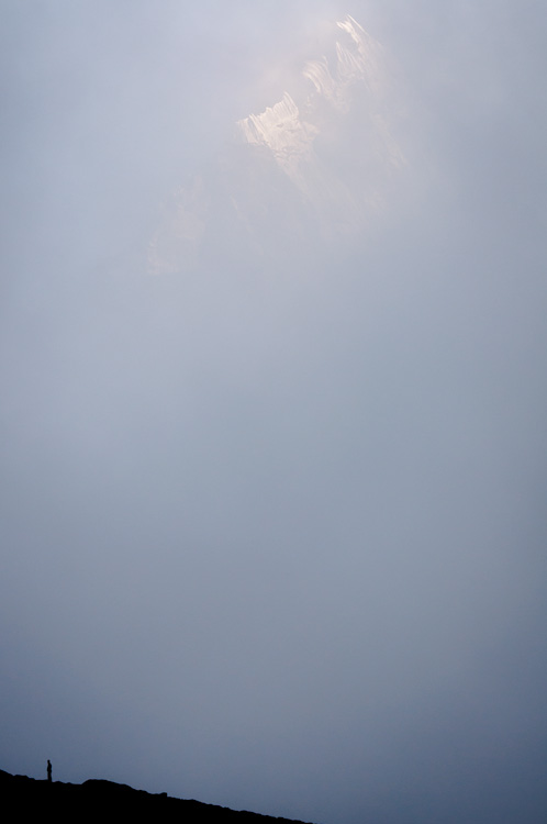
Weekend assignment 20 - Negative Space
Hi all.
for this weekend the assignment is: make a photo where the attention to the subject is created by the emptyness of the rest of the photo. Where normally the rule is to fill the frame with the subject, in this case we'll go the opposite side and make the object smaller and fill the photo with an empty background. think of a lonesome tree in the mist, or a single car on a 16 lane highway, or a person on the second step of a 100 step stairs... make them look small, but get attention anyway by showing there is nothing else to look at.
what is the difference with minimalism I hear you wonder.... well, in minimalism the subject can and should still be the main focus of the photo, still fill the frame, follow the rule of thirds. in an negative space composition it does not, it can't, because that would ruin the composiiton.
example from 2021 by u/ectivER https://imgur.com/a/lTugXCC
10:55 UTC
30 - Working the scene
Making good photos takes time, attention, technique and a lot of work. Knowing your stuff is step one, training your eye to see possibilities is step two, but working the photo will always be part of taking photos.
what is working a photo?
Let's say you're at a nice beach, it's a half hour before sunset and you have a camera and tripod... what to do?
First I would look around to see what is there... I'm looking for things that will make my photo more interesting, pleasing... and I have time to do this. A pier could give me leading lines if it's directed the right way, some nice stones could give me a nice foreground, ships could be nice but it's early for that. I look for structures in the sand, water for reflections, colour of sand.
Now I'll choose a spot, and make a test photo. The sun is still to high but I can project it's path to imagine where it's going to go under...
Now, in my testphoto there is a trashcan, a woman under an umbrella, some birds sitting round water. I want the sun big so I use a longer lens, getting farther away from the woman to fit her in the right place in the frame, the sun will set next to her umbrella now, great. Do I shoot horizontal or vertical? Horizontal in this case, it fits the scene
I don't want to see the trashcan, so I move or zoom to put it out of frame. The woman is just where the sun will go under so I move a bit to place her in the opposite side of the photo of where the sun will go under, she fits my story perfectly. I lose the birds that way but that would be a completely different photo, I had to choose.
Now the sun is getting close to setting so I make some test photos again to get my exposure right. I know it's going to get a bit darker near sunset so I put that in my thoughts and wait for the moment of perfection... hoping the woman doesn't leave, knowing I can change to the birds with ease if that would happen
The sun is nearly touching the sea, I make my photo, check the preview and histogram, it's good, I have my shot.
Making good photographs is never point and shoot, it's reviewing the viewfinder or previewphoto and finding the problems. It's about using your gear, knowledge and technique to fix those problems, to improve the photo each time untill you've made the best photo you can make at that time and place. The photo where your review says nothing can be improved anymore, only at that time you go find the next photo.
Things to consider:
- subject focus
- subject isolation
- subject light (quality, colour, angle, softness, ...)
- background
- cutoff
- framing/composition
- distractions
- lines (leading or crossing)
- lens problems (flare)
- angles (is the photo level, are the buildings straight)
- subject expression and pose if a person or animal
- ...
This is the reason reviewing peoples work is important, critiquing is important, because it teaches you to critique your viewfinder, a scene before ever taking a first photo...
and don't be afraid to NOT TAKE a photo when you know you'll throw it out in post... I can do an entire photowalk and come home with 10 pictures... 9 are keepers on a really good day, but I considered, and decided not to make, hundereds of potential photos that I would have tried to make and fail 5 years ago... now it was all done not using the camera at all
For a more visual way to explain this, watch the "crush the composition" video by Scott Kelby. I can't seem to find a free working link but it's worth the watch and price if it's reasonable.
10:29 UTC