/r/photoclass


This is an introduction to photography course taught by /u/clondon and /u/makinbacon42. It was originally conceptualised and run by /u/nattfodd and then run for many years by /u/aeri73
This is an introduction to photography course taught by /u/clondon and /u/makinbacon42
The original photoclass written and taught by /u/nattfodd has a permanent home! /u/Aeri73 then took over the course running it until 2023.
The previous versions can be found here:
2012 2013 2014 2015 2016 2017 2018 2019 2020 2021 2022 2023
We are indebted to many other uses that helped run, moderate or give feedback in these previous editions.
/r/photoclass
21,232 Subscribers
Unit 2: Assignment
#With this assignment, you will…
- Create a coherent photo series that demonstrates effective storytelling.
- Analyze and compare how different gear (phone vs. dedicated camera) or focal lengths impact your final images.
- Organize your photographs systematically and prepare Raw files for future post-processing.
- Engage with mentors and peers by seeking targeted feedback on both technical and creative dimensions.
In this assignment, you will create a mini photo story (3–5 images) around a subject or event of your choice. You’ll incorporate lessons about camera choice, focal length, and basic image organization. The aim is to practice both the technical and creative aspects of photography while reflecting on how different tools or settings can shape your results.
#Instructions
##Step One: Choose Your Subject or Event
It can be anything—from a local event to a quiet moment in everyday life. The point is to tell a small story or document a scene through a short series of 3–5 images.
##Step Two: Use Two Approaches
If you have two different cameras (e.g., your phone and a dedicated camera), capture at least one image with each device. Or, if you only have one camera, use two different focal lengths (e.g., a wide and a tele lens, or one prime lens in two shooting distances). The goal here is to show how equipment (or focal length choices) can alter the look and feel of your final shots.
Focus on: Exposure and Composition
Keep an eye on your camera settings. If you’re comfortable adjusting them, feel free to do so. Otherwise, use automatic modes—your main job is to compose effectively and get the best in-camera exposure you can.
Shoot Raw+JPEG if your camera allows (store the Raw for a future editing lesson). If not, just shoot JPEG.
##Step Three: Finalize Images
No heavy editing. Submit the images mostly straight out of camera (“SOOC”). If your camera or phone has built-in profiles (e.g., black and white, vivid), feel free to use them, but no post-processing beyond basic cropping or straightening.
##Step Four: Organize your Files
After shooting, transfer your images to your computer (or cloud). If you haven’t established a file organization system yet, give it a try this week. Label or group your images clearly so you know which came from which camera/focal length.
##Step Five: Submit your Photo Story & Reflection
Pick 3–5 images that best tell your story. If you used two cameras or two focal lengths, highlight at least one shot from each approach. Include a brief written reflection. What did you photograph, and why? How did using two different cameras or focal lengths affect your process or final images? Did you notice limitations with either device or focal length? Were there advantages to either? How did you organize your files? Finally, tell us what kind of feedback you’d like — technical, compositional, narrative, etc.
#tl;dr: What to Hand In
Your final 3-5 images.
A short paragraph or two reflecting on the points above.
(Optional) If you want to keep it fun, you can post the images without revealing whether you used a dedicated camera or phone camera or which focal length you used for each. Let your peers guess in the comments!
##Don’t forget to write in your Learning Journals!
##Enjoying the class?
This class runs entirely on volunteer effort, and donations help cover the costs of keeping it available for everyone, focusing on education and community for all photographers.
##Use this thread to submit your assignment photo(s).
20:53 UTC
Unit 2: The Gear, Part 2
##This is a continuation of Unit 2, Part 1
Video - Introduction to Raw vs. JPEG
#Introduction to image file types
You probably have already encountered the terms ‘JPEG’ (an acronym for Joint Photographic Experts Group) and ‘raw,’ in regards to file types. To really understand the difference between the two, we need to go back to the components of a camera. As you may remember, a digital sensor is a grid of photo-sensitive receptors. The result of an exposure is just a big bunch of numbers corresponding to the light level recorded at each pixel. This does not make a visible image. A number of steps are still required before an image can be viewed: obtaining color information for each pixel, applying white balance, adjusting contrast, sharpening, adjusting saturation, and possibly some other treatments.
There are two ways to perform this task. You can let your camera do it for you, with minimal input, resulting in a JPEG image file. Or, you can tell the camera to do as little as possible and perform each step yourself with dedicated software later on. This process requires a raw file.
Interactive element found on the site
#So, what are raws and JPEGs, exactly?
JPEG has the advantage of simplicity. There is no need to spend additional time in front of a computer. In-camera processing has come a long way, and many skilled editors still use straight out of camera (SOOC) JPEG images as their final photo. Some camera manufacturers have become known for their SOOC images, notably Fujifilm and their film-replicating recipes. In some fields such as photojournalism and sports photography, JPEGs are commonplace for their speed of transfer and ability to rapidly push good looking images to editors for quick publication.
Raw files are more complex and will require additional effort from the photographer. There are, however, significant benefits - namely control over every aspect of the final image. Think of a raw file as all the ingredients to a sandwich laid out in front of you. It’s your job to cut the bread, assemble the meat and vegetables, and top it off with a sauce. The same principle applies to raw files. You have all the data there, and it’s up to you to make choices in exposure, white balance, contrast, color balance, sharpening, et cetera.
Processing a raw file can feel daunting at first, but don’t stress over it too much at the moment. We have an entire unit about post processing coming up where we will learn how to turn raw files into the final image you’ve envisioned. For now, remember this key point: raw files give you more control over the final image. They also allow for more leeway in exposure at the time of shooting.
You may be asking now - ‘why would I choose one over the other?’ There are some key points to acknowledge when choosing whether you’ll be working mostly in raw or JPEG. Most cameras allow you to record both simultaneously, as well. So, let’s look at the benefits of each.
#Benefits of JPEG
Why choose JPEG?
As previously stated, there are a lot of instances in which JPEG is a great choice. Let’s look at some of the key benefits. While reading, think about how these benefits would present themselves in your personal shooting style and goals.
Smaller File Size: JPEG files are significantly smaller compared to Raw files. This is beneficial for saving storage space on memory cards and hard drives, and making it easier to manage and share a large number of images more quickly.
**Ease of Sharing: **JPEG is a universally supported format, making it easy to share images across different devices and online platforms without compatibility issues. It is widely accepted for web uploads and social media sharing. For photographers who are new to post-processing, JPEGs can be more approachable. The in-camera processing helps produce a polished image without the need for advanced editing skills or specialized software.
**Simplified Editing and Faster Workflow: **JPEG files require less post-processing compared to raw files. The in-camera processing applied to JPEGs, including color correction and compression, can save time in the editing process, especially for photographers who prefer a quick and efficient workflow.
**In-Camera Adjustments: **JPEG files allow photographers to apply various in-camera settings, such as white balance, sharpness, and color profiles. This can be advantageous for photographers who prefer to get the image “right” in-camera without extensive post-processing.
**Continuous Shooting: **The smaller file size of JPEGs allows for a greater number of continuous shots when using burst mode. This is particularly useful in fast-paced situations where capturing multiple frames per second is essential.
Now that we can identify instances wherein JPEG would be advantageous (or not), let’s explore the benefits of using raw files.
#Benefits of Raw
Video - Post Processing Raw Files
#Why choose raw?
For many photographers, raw is the way to go. As we’ve already learned, raw files give us more latitude in our post processing. Let’s look at more key advantages to using raw.
**Higher Image Quality: **raw files contain more data and information, preserving details and colors that may be lost in JPEG compression. This results in higher overall image quality, especially in situations with challenging lighting conditions.
Greater Dynamic Range: Raw files typically capture a broader dynamic range, allowing for better retention of details in both highlights and shadows. This is beneficial when photographing scenes with high contrast.
Non-Destructive Editing: Raw files allow for non-destructive editing, meaning adjustments can be made without permanently altering the original image data. This provides photographers with the freedom to experiment and refine their edits.
**White Balance Adjustments: **Raw files enable precise control over white balance during post-processing. Photographers can easily correct or fine-tune white balance settings without compromising image quality.
Adjustable Exposure: Raw files offer more latitude for exposure adjustments, allowing photographers to recover details in overexposed or underexposed areas. This flexibility is especially valuable in challenging lighting situations.
Flexible Color Correction: Raw files provide extensive control over color correction, allowing photographers to adjust hues, saturation, and color balance with greater precision. This is particularly useful for achieving accurate and consistent color representation.
More Editing Options: Photographers have more control over sharpening, noise reduction, tone and contrast, perspective, lens corrections, and much more.
Future-Proofing: Raw files contain all the original sensor data, making them more future-proof. As software and editing tools evolve, photographers can revisit raw files to take advantage of new processing capabilities without loss of image quality.
Customizable Compression: While JPEG files use lossy compression, raw files can be converted to various formats with different compression levels, allowing photographers to choose the most suitable file type for their specific needs.
Since raw files are not directly viewable, you will need software which can read and manipulate raw file types. We will go into more detail during our processing unit, but some popular options for software include:
- Adobe Lightroom (paid)
- Capture One (paid)
- ON1 Photo Raw (paid)
- DxO PhotoLab (paid)
- Affinity Photo (paid)
- RawTherapee (free)
- Filmulator (free)
- Darktable (free)
- Apple Photos (included in MacOS, iOS, and iPadOS)
- Brand Specific Software: your camera may have come with raw processing software specific to your brand such as Canon DPPS.
Video - Introduction to Digital Workflow
#Introduction to digital workflow
This week we’re going to talk about (almost) everything that happens after you’ve hit the shutter and taken an image. This is what we call a workflow, which you can think of as a pipeline or a conveyor belt. Each step takes the result from the previous task and modifies the image, giving it to the next task in line. The whole process of organising your images and other multimedia files in something relatively organised bears the somewhat pompous name of digital asset management (DAM). You will have to pay attention to it sooner or later. The earlier you organise yourself, the easier and less time-consuming it will be.
Most of this lesson will be aimed at those shooting on mirrorless or DSLR cameras who want to organise their images onto a computer. There are some completely cloud-based options for mobile shooters, but we’ll mostly consider this outside this lesson's scope.
#Software
Before we look at the things that we can do with your images after capture, we need to look at one of the most critical pieces in your workflow; the software. Yes, you can simply copy your images into dated folders on your hard drive, but digital asset management (DAM) software is incredibly powerful and can provide a lot of worth in organizing your images, and in finding them afterwards.
Ever tried to find that one photo taken 5 years ago, but you can’t exactly remember where you took it or where it’s located on a pile of hard drives or a mess of folders on your computer? DAM software (and a little bit of organisation by you) should help you find photos in a situation like this and make your life easier. These pieces of software are in another class from those that can simply read and allow you to edit a raw file - though most of these have those capabilities also. These applications allow you to organize your images, apply and use tags, search and edit metadata, and many other powerful tools.
Here is a short, but not completely exhaustive list of DAM software:
- Adobe Lightroom
- Capture One
- ON1
- DxO PhotoLab
- Darktable (Free)
- Ansel (Free)
- digiKam (Free)
Which particular software you choose is almost completely up to you. The majority of professionals are still using Adobe Lightroom or Capture One, though other players are emerging in ON1 and DxO PhotoLab. Options like Darktable, Ansel (a fork of Darktable), and digiKam offer great free and open-source solutions for enthusiasts who aren’t sure about dropping a chunk of cash on software - or adding to the seemingly ever-increasing list of monthly subscriptions.
#Introduction to organization
So you have shot an image, using all the information from the previous lessons. It is now living happily on your memory card in the form of a weirdly named .jpg or raw file. There’s probably no information in the file name about what trip the photo was taken on, which camera took it, what settings you used, etc. We want to be able to organize your images using the metadata stored within the image file. Metadata is information about data that helps describe, organize, and manage it, such as details about when a file was created, who created it, and its content. We are lucky to live in a digital world: we no longer need to deal with bulky boxes of negatives. But of course, we still need to index and label our images just as before, or it will be just as impossible to find an old image as it was in the days of film. Any photographer who has been shooting for a while will have tens, sometimes hundreds of thousands of images in their library. If you don’t organize your library, and if you don’t do it early, you will have an impossible mess on your hands.
Now you have one of these pieces of software we talk about above, the first part of a digital workflow is called ingestion, basically a fancy way of saying that you’re copying your files onto your computer. This can be done either directly from the camera, or via a card reader.
There are many different ways you can set up your directories, but the general premise is that you should organize your files in a well-defined, well-thought-out structure that ultimately makes sense to you. A very popular way of doing this is simply by date: all files shot today would go in the folder 2024 > 2024-02-05.
Changing filenames is somewhat optional but can also be important, you could name your date and location, which would give 20240205-London-001.nef, or you could include the date, model name and camera e.g. 20240205-Chelsea-Z6-001.nef. This gives you some insurance that you can find your files even if you cannot launch your DAM software. Most DAM software offer means to inject text into the file name so you can take advantage of this and rename on import.
Once all the images are inserted in the library, it is time for reviewing and tagging. You should go through your images in full screen and sort them into different groups, marking the best ones for further work. Most software has keyboard shortcuts so you can quickly assign combinations of flags and number ratings to your images. Culling obviously bad images; be it out of focus, too overexposed, or just simply duplicates is important in this step to reduce the amount of data you collect. Storage is relatively cheap now, so it’s up to you whether you’d like to delete “rejects” or just let them sit in the folder. You should also investigate if your DAM offers previews - these are normally a smaller JPEG version that can be quickly loaded, so it does not have to render the raw for every file you want to quickly view in the culling process.
This is also the step where you should add relevant keywords to your images, to make it easy to find them again when needed, though some DAM software offer this feature on ingestion and import. The camera will automatically record shooting parameters (in the EXIF tags) but you should add further information indicating information on the content of the image (location, subject, style, etc). Throughout the editing process, you can also add keywords or tags for the current “status” of the image, whether it is marked as being fully processed, waiting for editing, scheduled for a further look, archived for future use, to be removed, etc. Doing this early will allow you to search through old images quickly!
Another important concept is to use non-destructive editing (NDE). This means that you are never overwriting the original file and always have the ability to go back to earlier stages of the editing process. NDE is built-in in software like Lightroom, Darktable, etc. where your edits are kept in a catalogue file and you need to export your images for them to be applied. But you need to be careful if you use Photoshop, GIMP or similar applications. Either keep an untouched bottom layer or, better, always work on a copy of the image, never on the original. Your style, your tastes, your skills and your software will all evolve in time, and you will want to be able to return and edit a raw image from scratch.
The caveat to this whole section is that you should find a logical system that works for you and your particular DAM software!
The other major component of your digital workflow is backups. It seems like nearly everybody needs to go through one major data loss before getting serious about backing up. Just make sure it doesn’t happen to your most important images. This isn’t an exhaustive discussion on backup by any means, there are plenty of specialized articles which can delve into the nitty gritty details, this is more a primer to have you aware of the basic concepts and media. The blog of cloud storage company Backblaze has a wealth of information if you want to go further. All backup options have their upsides and downsides, and the truth is that there is no perfect solution to perfectly store digital files for a long period.
Optical media (CDs and DVDs) only last a few years at best. Hard drives provide a great gigabyte-to-dollar ratio and, when treated correctly, are one of the most reliable storage solutions. They are easily transported if required and scale well into multi-drive arrays using RAID (remember, RAID isn’t immediately a backup method!). That said, hard drives still are prone to failure, often catastrophically and often with no warnings. Tape backups are more reliable than hard drives but still do not last forever and are an incredibly niche media outside of a data centre. Storing files on the cloud e.g. Amazon S3, Backblaze, Backblaze B2, Google Drive, Dropbox, Amazon Photos and similar services, are a great option to have the easiest way to have secure offsite storage. Pricing is generally very competitive, though some solutions scale to multiple terabytes better than others, and most also come with a versioning history. A critical factor in the viability of these cloud-based services is they are highly dependent on your internet upload and download speed, upload to move the data there and download to retrieve it in case of an issue with other media. Cloud-based storage is generally the last line of defence if all your local media have failed. Of course, even a hypothetical immortal media wouldn’t survive fire, flood or accidental erasure. For these reasons, the basic concept of backups follows the 3-2-1 strategy; in that three copies are made of the data to be protected, the copies are stored on two different types of storage media, and one copy of the data is sent off-site. Businesses and working professionals almost always use variations of this, but the 3-2-1 idea holds well for hobbyists and enthusiasts where downtime if a failure were to occur isn’t a big issue.
As to what you should backup, at a minimum, you should backup your raw and processed versions of your best images, though with the price of storage, it is very easy to backup your entire photo library. It should also be mentioned that you want to have backup at both ends of the workflow pipeline, you want to have this process started as soon as you start copying files from your memory card to your computer. This copying stage is often where you are most vulnerable. You also want to ensure all your newly added tags, flags, ratings, non-destructive edits, and file duplicates with destructive edits are backed up as you make the changes within your DAM software. Here are some recommendations for backup ideas.
We don’t condone it, but the simple start of this could be:
- One copy on your computer
- One copy on an external hard drive, that every week you bring home from another location, backup your computer and take that drive back to another location. This leaves you vulnerable to loss of files created in this window.
An ideal option is:
- One copy on your computer
- One copy on an external hard drive in your home. This is always connected to your computer backs up at a regular time interval providing coverage if your main drive dies.
- One copy on an external hard drive, left in another location e.g. family, friends, workplace etc. Bring this drive home periodically and swap it with your other external drive at home. This protects you against fire, flood etc. loss in your immediate area, but might not cover your whole city. Since this runs manually it also protects you from ransomware or similar malware.
A more ideal option is:
- One copy on your computer
- One copy on an external hard drive in your home. This backs up at a regular time interval providing coverage if your main drive dies.
- One copy on a cloud-based service, this also backs up at a regular time interval and protects you against fire, flood etc. loss in your immediate area, and will also cover against this happening across your whole city.
In the last situations where you have two backup methods running automatically, you should also have a third, manually run in the case of ransomware or malware that encrypts your devices and locks you from your computer. In the following weeks, we’ll cover more about how to edit your photos, but this is a start to getting your images organised and keeping them safe.
20:49 UTC
Unit 2: The Gear, Part 1
###Note: This unit has multiple interactive elements that are not visible on Reddit. It is suggested that you complete this unit on the website: https://www.thefocalpointhub.com/photoclass-2025
###Unit Two: The Gear
We’ll start this class by dipping a toe into the technical side of photography, beginning with a simple question: “What exactly is a camera, and what are its key components?” You may already know some of this, but covering it ensures we all share the same vocabulary.
In the strictest sense, a camera is just a device that captures light. It does so by focusing light onto a photosensitive surface. From this straightforward idea, we can see the three main parts of any camera.
Interactive element found on the site
#The Sensor
The sensor is a photosensitive surface which reacts to light through either a chemical process (film) or an electric one (digital sensor). There are fundamental differences between these two, which we will cover in a subsequent lesson. But for now, we can consider both identical: they are a grid of several million tiny dots (pixels), and each can remember how much light was received in a given period. Each sensor has three important qualities: resolution, size, and what we can call “quality.”
Resolution is simply the number of pixels - it is slightly more complicated with film, let’s not worry about that for now. The more pixels you have, the more fine-grained detail you can theoretically record. Any resolution above 5 or 6 megapixels (millions of pixels) will be enough to display on a screen. Higher resolutions come into play for two important applications: printing and cropping.
To have a good reproduction quality, it is generally estimated that between 240 and 300 pixels should be used for every inch of paper (dots per inch, or dpi). This will give a natural limitation to the biggest size one can print if the print is viewed closely (viewing distance is also an important aspect of resolution for print). For instance, a 6MP image at the dimensions of 2000×3000 pixels can be printed at a maximum size of 12.5×8.3″ at 240dpi (2000/240 = 8.3, 3000/240 = 12.5). Printing bigger by lowering the dpi or artificially increasing the resolution is possible, but this will come at a loss of image quality. Having a higher resolution allows you to print bigger.
Cropping means reducing the size of an image by discarding pixels on the sides. It’s a very useful tool and can often improve composition or remove unwanted elements from an image. However, it will also decrease resolution, since you lose pixels. Therefore, how much cropping you allow yourself will depend on the initial resolution, which you want to be as high as possible. This is also what some cheaper cameras, along with phone cameras, call “digital zoom.” General point of advice is that digital zoom should be avoided, as the same effect can very easily be reproduced in post-processing through cropping.
The physical size of the sensor is very important and will have an impact on many other parameters, most of which we will see in subsequent lessons. These include: field of view (“crop factor”), depth of field, high ISO noise, and dynamic range. Bigger sensors will also allow for more widely spaced pixels (increasing image quality) or more of them (increasing resolution). Bigger is almost always better, and this is one of the main reasons that Digital Single-Lens Reflex cameras (DSLRs), as well as medium format cameras, produce a much better image quality than compact cameras.
Finally, sensor quality is harder to quantify, but it refers to how well the sensor reacts to difficult light conditions. Low light conditions will require an increase in ISO, and will demand a sensor to have as little noise as possible. High contrast conditions will require a good dynamic range to be recorded adequately.
#The Lens
The lens is the second component of any camera. It is an optical device that takes scattered light rays and focuses them neatly on the sensor. Lenses are often complex, with up to 15 different optical elements serving different roles. The quality of the glass and the precision of the lens will be extremely important in determining how good the final image quality is. Lenses must compromise, and a perfect all-around lens is physically impossible to build for a reasonable budget, weight, and overall size. For this reason, good lenses tend to be specialized and having the ability to switch them on your camera will prove extremely useful.
Lenses usually come with cryptic sequences of symbols and numbers that describe their specifications. Without going into too much detail, let’s review some of their characteristics:
Focal length refers roughly to the “zoom level,” or angle of view, of the lens. We will address this in more detail in the next lesson, as it can be a surprisingly tricky subject. A focal length is usually expressed in millimeters. You should be aware that the resulting field of view actually depends on the size of the camera sensor on which the lens is used - also known as the crop factor. For this reason, we often give “35mm equivalent” focal lengths, which is the focal length that would offer the same view on a 35mm camera (the historic film Single-Lens Reflex format) and allows us to make meaningful comparisons. If there is a single length (e.g. 24mm), the lens doesn’t zoom, and it is commonly referred to as a “prime lens.” If there are two numbers (e.g. 18-55mm), you can use the lens at any focal point within that range. Compact cameras often don’t give focal lengths but simply the range, for instance, 8x. This means that the long end is 8 times longer than the wide one, so the lens could be an 18-144mm, or a 35-280mm, etc. The aperture is a very important concept which we will talk about in much detail later on. The aperture is an iris in the center of the lens which can close to increasingly small sizes. This action limits the amount of light that hits the sensor. It is referred to as an f-number, and you’ll see it written like f/2.8, for example. To make things more confusing, the smaller the number, the bigger the aperture! For now, don’t worry about this too much. The important number on a lens is the maximum aperture, and generally, the lower the better. Professional zoom lenses often have f/2.8 maximum apertures, and cheaper consumer lenses have ranges such as f/3.5-5.6, meaning that at the wide end, the maximum aperture is f/3.5, and at the long end, it is f/5.6. Aperture can be closed to tiny levels, usually around f/22.
Lenses also need a focusing system. Nowadays, most lenses have an internal motor that can be piloted by the camera - the autofocus. They also have a ring to allow the photographer to focus manually. Lenses are often equipped with stabilization systems (called VR by Nikon, IS by Canon). They detect small movements, usually handshake, and compensate for them by moving the optical elements internally in the opposite direction of the movements. Though not magic, these systems tend to work very well and allow sharp images to be taken at slower shutter speeds. Side note: lens-based stabilization is becoming increasingly less important due to sensor stabilization in modern mirrorless cameras.
Interactive element found on the site
#The Body
Finally, the body is the light tight box connecting the lens to the sensor, and ordering everyone around. Though some film cameras are just light-sealed boxes, most digital cameras are now small computers, sporting all sorts of features. Let’s review some of the components found in most bodies:
The shutter. Think of it as a curtain in front of the sensor. When you press the trigger, the curtain opens exposing the sensor to light from the lens. It then closes again after a very precise amount of time, often a tiny fraction of a second. Most shutters operate between 30 seconds and 1/4000 of a second. That duration (the shutter speed) is one of the three very important exposure factors, along with aperture and ISO (more on those later!). Some cameras lack a physical shutter and will use global or electronic shutter - there are advantages and disadvantages to this. A light meter. As the name suggests, it measures the quantity of light and sets the exposure accordingly. How much manual control you keep at this stage is one of the most important decisions in photography. There are different metering modes, but except in very specific cases, using the most advanced, most automated one will provide the best results - and make things easier on you!
A focus detector. This is used to drive the autofocus motor in the lens. There are two competing technologies: contrast detection and phase detection. These systems tend to vary greatly between basic and advanced bodies, but it should be noted that they all need reasonable amounts of light to work properly.
A way to store the image just created, and make room for the next. Back in the days of film, this was just a lever to advance the roll to the next unexposed frame. Now, it is a pipeline that ends up in the memory card that the camera is using. If you are shooting JPEG instead of raw (more on this in another lesson), there is an additional stage where the internal computer performs all sorts of black magic on the image to output a ready-to-view JPEG file.
A way to frame. It can be a multitude of things; optical or electronic viewfinder, LCD screen, or even ground glass. DSLRs have an optical viewfinder that allows “through-the-lens” viewing and immediate feedback. Mirrorless, compact cameras, and phones use an electronic viewfinder allowing us to preview the image’s exposure, depth of field, et cetera. Rear LCD screens of cameras have taken significant jumps in usability in recent years and are now a very viable option for framing your images.
We’ve talked about the different components of any camera, but not really about the different types of cameras out there. We hope this might be useful if you’re on the edge of purchasing a camera for the photo class. Friendly reminder: we’re not trying to spark your G.A.S. If reading this fuels your need to buy more and more gear, go back to lesson one - the G.A.S. section, in particular.
We will classify cameras into six somewhat arbitrary groups: phones, compacts, mirrorless, DSLRs, film, and exotics. You can forget about the last category, as anyone using these probably doesn’t need an introduction class. For specific camera recommendations, we recommend the friendly /r/photography Questions Thread.
IMG-iPhone 12 Mini - automatic settings
#Phone Cameras
Phones, everyone has one in their pocket these days. They are an excellent choice whether you are a beginner photographer or a very experienced one looking for a camera that is always with you.
Phones generally have quite small sensor cameras, but to make up for that, they take advantage of the processing power of your phone. Phones rapidly do large amounts of computational photography to improve their final image, with no work from the photographer necessary. This can include live image stacking to improve low light performance or to produce handheld long exposure images. A large number of phones have the ability to shoot raw, though this means you miss out on the computational ability of your phones processing. Making that choice is one we’ll help you with in our JPEG vs. raw lesson. One downside to phone cameras is there is no way to physically adjust aperture, so depth of field is more or less fixed with these small sensors. That said, modern camera phones have multiple lenses, and built in tools to emulate varied depths of field.
Phones for the most part have gutted the market for compact point-and-shoot cameras discussed below and thus are usually the default complete beginner camera before a mirrorless or DSLR.
IMG-© Chelsea London 2020 | Fujifilm X100F | ƒ/4.0 | 23.0 mm | 1/125 | ISO 320
#Compact Cameras
Compact cameras, sometimes also called point and shoots, probably were (depending on your age) your first digital camera. Their main advantage is their low profile. When using a compact, most people will assume you are just a tourist and won’t give you a second look, whereas even a small DSLR or mirrorless camera will attract attention. Most cheap compact cameras come with downsides as a result of their small size. The sensor is usually very small, thus low light capabilities are of lesser quality, and the depth of field is always quite large. Lenses tend to be of mediocre quality and with limited maximum apertures. The LCD screen is almost exclusively for framing, which is a problem in bright light. One of the most annoying characteristics of compacts, is the infamous shutter lag – the delay between pressing the trigger and the photo actually being recorded. Compacts also assume the photographer wants the camera to make all the decisions and it is often difficult and if not impossible, to gain manual control of the various camera settings.
Phone cameras have essentially gutted the market for most of these cameras, except in high-end compacts, which usually contain larger sensors and higher quality lenses, pop-up or integrated electronic viewfinders to improve framing along with the ability to control all aspects of the camera to the degree of a DSLR or mirrorless camera.
Point-and-shoot cameras do seem to be making a resurgence with the interest in “digicams,” usually cheap point and shoot cameras from the ‘00s where the low image quality, interesting processing and “vibe” are part of the image’s look.
IMG-© Sean Makin 2016 | Nikon D5100 | 17.0-50.0 mm f/2.8 @ 17.0 mm | ƒ/8.0 | 8s | ISO 100
#DSLR
A Digital Single-Lens Reflex (DSLR) camera is a popular choice among photographers due to its versatility, image quality, and manual control options. These cameras feature interchangeable lenses and an optical viewfinder - providing a real-time, lag-free preview of the scene.
DSLRs are equipped with larger image sensors (compared to compacts or phones), leading to superior image quality and better performance in low-light conditions. The ability to use a variety of lenses is also key to the DSLR, allowing for sharp and detailed photos with a lens most appropriate for the situation. The manual controls on DSLRs provide photographers with the flexibility to adjust settings such as aperture, shutter speed, and ISO, enabling precise control over their shots. Another strength of DSLRs lies in their fast and accurate autofocus systems, making them suitable for capturing dynamic and fast-moving subjects, like in sports photography. The durability of DSLRs is a significant feature, as these cameras are often built with robust materials and weather-sealing capable of withstanding a variety of environmental conditions.
DSLRs do come with some drawbacks, their size and weight make them less convenient for on-the-go photography compared to more compact options. The audible noise produced during operation, particularly when using the mirror mechanism, may be a concern in quiet environments.
With the increasing proliferation of mirrorless cameras, DSLRs offer fantastic value for money on the used market, especially for someone wanting to dip their toes into photography with a “proper camera” where they can have full control of their images. In recent years, mirrorless cameras have gained popularity as they address some of the disadvantages of DSLRs, offering comparable image quality in a more compact and lightweight form. This is highlighted through Nikon and Canon appearing to have ceasing development of entry-level DSLR cameras in favor of mirrorless models.
IMG - © Chelsea London 2018 | Fujifilm X-T10 | XF35mmF1.4 R @ 35.0 mm | ƒ/2.8 | 1/320s | ISO 5000
#Mirrorless
Mirrorless cameras (or MILC, for Mirrorless Interchangeable Lens Camera) are cameras that have gained popularity for their compact size (compared to DSLRs) and versatility in hybrid photo-video shooting since their first appearance c. 2008. These compact digital cameras lack the traditional mirror mechanism found in DSLRs, contributing to a lighter and more portable design. One distinguishing feature is the use of electronic viewfinders (EVFs) or LCD screens for composing shots, eliminating the need for an optical viewfinder. All major manufacturers now make mirrorless cameras across multiple sensor sizes from full frame to APS-C, M4/3 and 1”.
Mirrorless cameras, like DSLRs, support interchangeable lenses. The absence of a mirror mechanism can lead to quieter operation, making them more suitable for situations where discretion is crucial. Additionally, mirrorless cameras often excel in video recording, offering advanced features such as 4K recording, high frame rates, and reliable autofocus during video capture. A significant advantage of mirrorless cameras is their compact size and lightweight nature, making them ideal for travel or street photography. The electronic viewfinder (EVF) in mirrorless cameras offers a real-time preview of exposure and depth of field, aiding photographers in making decisions before capturing an image.
However, mirrorless cameras come with certain disadvantages. One notable drawback is their battery life, which tends to be shorter compared to DSLRs due to the power demands of EVFs and continuous autofocus. Some mirrorless systems may also have a more limited selection of native lenses compared to established DSLR systems, along with a more limited used market due to their newer introduction.
Some photographers also prefer the optical viewfinder (OVF) of DSLRs, providing a direct optical view through the lens without relying on electronic displays. Some cameras do offer a hybrid EVF and OVF. The choice between a mirrorless and a DSLR camera often boils down to personal preferences and specific photography needs. As the mirrorless market expands, addressing their issues and incorporating new features, these cameras are becoming the way of the future.
IMG - © Chelsea London 2019 | Minolta X-700 | MD 45 f/2 | Portra 800
#Film Cameras
Film cameras use photographic film to capture images. These cameras rely on a chemical process to develop and produce physical prints. Despite the prevalence of digital cameras and smartphones, there has been a resurgence of interest in film cameras among certain photographers and enthusiasts. Like digital, film cameras take various forms including Twin-Lens Reflex, SLR, rangefinders, film point and shoot, toy cameras like Holga and Lomography cameras, and so on. With more and more photographers taking interest in film photography, used prices are significantly higher than they were even just 10 years ago.
This resurgence has been driven by the distinct analog aesthetics, offering a nostalgic and unique look. The tactile experience of loading film and manually setting exposure settings, as well as the limited number of exposures per roll, encourages a more deliberate and thoughtful approach to photography. The challenges and limitations posed by film contribute to a creative and intentional shooting process. Additionally, the appeal of vintage and unique cameras, often no longer in production, adds to the renewed interest in film photography.
IMG - © Sean Makin 2023 | DJI Mavic Air 2 | 24.0 mm f/2.8 @ ƒ/2.8 | 4.5 mm | 1/120 | ISO 100
#Exotics
There are a number of cameras that are well outside the realm of a normal photographer, including big stuff. In the digital world, cameras larger than 35mm mean medium format backs or more “consumer” medium format mirrorless cameras. The cheapest and most “consumer” of these costs $5,000, while more professional models are over $10,000 without lenses. Still, their resolution and image quality are hard to beat, with sensors pushing well over 100 megapixels. They have little application if you are not printing big or working as a commercial studio photographer, as the difference between high-end DSLRs and MILC will be hardly noticeable in everyday use. They are mostly used by commercial shooters and (rich) landscape photographers.
Rangefinders are another alternative to DSLRs, where the optical viewfinder does not pass through the lens. This permits a smart manual focus system based on split screens. The most famous of these cameras is the Leica M family. Photojournalists and street shooters love them, but they have a steep learning curve.
##Lenses
Video - An introduction to lenses
In your gear-buying research, you may have seen the idea that lenses are more important than the actual camera body. Simply speaking, this holds a lot of truth. We know that the camera body is what translates what the lens captures and writes it to either a digital sensor or film, but that information could not be collected without the use of a lens. The choices a photographer makes in regards to their lens has a dramatic effect on the final image.
Lenses determine how much of the scene is in focus (depth of field), what is seen in the image via focal length, and the distance at which you are able to focus. This lesson will mostly talk about focal length, and we’ll tackle the other aspects of the lens in future lessons.
#How do lenses work?
In simple terms, lenses focus light on to the camera sensor or film through a complex optical system. While we won’t get into the nitty gritty about all the intricacies of the different parts of the lens in this class, a basic overview of the main components will be beneficial.
The Front Element: Fancy word for the glass on the front of the lens. This piece both protects the inside elements and bends and refracts light as it enters the lens.
Lens Groups: Multiple lens elements arranged in groups. These lens groups work together to focus and direct light onto the camera's image sensor or film. Each lens element within a group has a specific optical function, and the arrangement of these elements can vary widely depending on the type of lens and its intended purpose. There are quite a few different types of lens groups, each with its own specific arrangement and number of lens groups depends on the type of lens and its intended purpose.
Aperture: The opening in a camera lens through which light passes to enter the camera body. It is a crucial element in photography as it directly affects the exposure of an image and plays a significant role in controlling depth of field. Aperture size is measured in f-stops or f-numbers (e.g., f/2.8, f/4, f/8). A lower f-number indicates a larger aperture, allowing more light to enter the lens. Conversely, a higher f-number represents a smaller aperture, allowing less light - we will go into that at more depth in a later lesson.
Rear Element: Lens elements located at the back of the lens, closer to the camera body. The specific functions of the rear elements can vary depending on the lens design and its intended purpose. Generally, the rear elements contribute to image projection, focusing, and reducing flare and other optical artifacts, amongst other things. Look at the attached diagram. Can you identify each of the lens’s elements?
Interactive element found on the site
#What are all those numbers on my lens?
Let’s take the time to identify what all those numbers mean on your lens(es). Have a look at the above image, we’ll use that as a reference point and example for the given numbers.
First up we see: “AF-S Nikkor 16-35mm.” Okay, so to break that down; AF-S means “Auto Focus - Silent Wave,” with “silent wave” just being Nikon’s cute way of saying their auto focus is quiet. “16-35mm” is our focal range. That means this lens can be as “wide” as 16mm and caps out at 35mm. We’ll break down exactly what focal length is in the next section of this lesson, just for now remember that numbers shown in millimeters (mm) are the focal length. The next set of numbers you see are “1:4” - our aperture (f-stop). This means this lens has a maximum aperture of f/4. On some lenses you’ll see a range, something like “4.0-5.6” showing that at your widest focal length, you have a maximum aperture of f/4 and at your narrowest focal length, you have a maximum aperture of f/5.6. Again, this may read as quite confusing, but don’t worry, we’ll get more in depth in our future aperture lesson. For now remember that numbers represented by “#:#” is the aperture.
On the front of your lens, you’ll see Ø with a number following it. Try and remember back to high school geometry - remember what what symbol means? If you said diameter, you’d be exactly right. The front of your lens has some threading on it. This is to attach screw-on filters. To ensure you get the right size filter, you need to know the diameter of your lens. That’s the number written after Ø on the front of your lens. If it says Ø52, for example, that means your lens has a diameter of 52mm, and that’s the size of screw-on filter (or lens cap!) you need.
For the remainder of this lesson, we’re concerning ourselves with only the focal length. The focal length is important as it determines the field of view (FOV), or in plainer terms: the area or angle of the scene that is captured by the camera and recorded in the resulting photograph.
Video - Introduction to Focal Length
Put simply, focal length is what determines how “zoomed in” you are, also often called field of view (FOV). Focal length is an actual length, expressed in millimeters - it corresponds to the distance between the optical center of the lens and the film plane. The lower this number, the less zoomed in you are. You’ll hear photographers use the word “wide” to talk about this because you can see a large amount of the scene. Conversely, if the number is high, the angle will be “narrow,” and you will only see a small portion of what is in front of you. In this instance, you are zoomed in. Being extremely zoomed in is referred to as “telephoto.” Some lenses, called “zoom lenses,” allow you to change your focal length. So-called “prime” lenses are fixed to one focal length.
The choice of a focal length is the very first step in composing a photograph. Focal length determines framing, so in that way, it is one of the most important choices you make as a photographer - every other choice (exposure, depth of field, etc) are dependent on your decision in framing.
Interactive element found on the site
#Going a bit deeper
While simplified, the above is really the need to know information. It does become more complicated, but if you’re not too fussed on the technical intricacies, understanding the idea of focal length determining your FOV is enough. For those with a more keen interest in the technical aspects, we must note that focal length gets more complicated when you start looking at the actual numbers. An 18mm lens on a medium format camera will produce a very different angle of view than the same focal length on a compact camera. A modern compact like the Sony RX100III has focal lengths between 8.8 and 25.7mm, yet the same values on a lens for a FX DSLR like the Nikon D850 would be exceptionally wide, making for a more difficult scene to compose.
The culprit of this phenomenon is what we call the “crop factor.” The focal length is a physical property of a lens, but the resulting angle of view, which is what we are really interested in, depends on another factor: sensor size. The bigger the sensor, the wider the angle of view for the same focal length. In order to convert angles of view between different formats, we use the crop factor, which is a ratio between the standard 35mm film area and the actual sensor size. For instance, Nikon DX cameras have a smaller sensor than their FX counterparts, which results in a 1.5x crop factor. This means that a 28mm lens on a DX camera will have the same angle of view as a 28*1.5=42mm lens on FX.
Of course, this works in the other direction too: if your sensor is bigger than 35mm film, then you will need longer focal lengths to obtain similar angles of view: on 4×5 large format cameras, 150mm is considered “normal”, whereas it would be firmly in the telephoto domain on a DSLR.
Because it can all be a bit confusing, especially with lenses that can be used on several different formats, it is common to give a “35mm equivalent” focal length: the focal length at which a 35mm/FX camera would give the same angle of view.
You just need to be careful when discussing actual focal lengths: remember that the final angle of view (which is probably what you are discussing) depends on the crop factor, and that everyone may be using different ones. This is one of the reasons it may be advantageous to disclose what gear you’re using, so there’s context as to what the crop factor is (or isn’t).
Sometimes, it will be worth getting closer to your subject and using a shorter focal length, if you want to create depth and emphasize perspective. Sometimes, you will have to walk backward and use a longer lens, if you want to compress perspective.
Interactive element found on the site
#Fact or Fiction: Distortion and Compression
A common misconception is that focal length has a direct relationship to distortion. Normally this will be demonstrated through a mid-shot - a portrait shot from the shoulders up. That demonstration, shown through .gif or static images, will show a face at 18mm, 56mm, and 80mm, for example, and there will be apparent distortion through squished heads and bulbous noses at 18mm, and more natural-looking head shapes and noses at 80mm. You’ve probably already seen this effect in your own selfies. But let’s look at this from a border point of view. Think about that selfie you’re taking. As it’s inherently taken by you, by your own hands, you can only hold the camera so far from your own face. Keeping that in mind, think now about that portrait with an 18mm focal length. We know that 18mm is quite wide, meaning there’s a lot of the scene in that image. To make sure the subject (in this case a person) is seen clearly and not lost in that massive scene, the photographer has to move closer. And closer. And closer. That physical distance between the photographer/camera and the subject is what’s causing that facial distortion. Step back far enough, and the subject’s face is perfectly proportioned. So now think about that 80mm photo - the zoom factor of the focal length allows the photographer to stand further away from the subject, thereby not introducing any facial distortion. Now think back to that selfie - does it reflect what you see in the mirror or photos taken by someone else? No, because the arm’s length you can provide yourself is not far enough away to negate any distortion.
That brings us to compression. The term "compression" is often used to describe the visual effect of narrowing the perceived distance between elements in an image. This effect is related to the choice of focal length and the resulting perspective in the photograph. Like that distortion .gif, you may have seen .gifs or visual representations of compression - normally with a farmhouse or shack in front of mountains. At wider focal lengths, the mountains behind the shack seem small and far away. At more narrow focal lengths, those mountains are massive, and right up on the shack. This “perspective flattening” can be used to a photographer’s advantage strategically.
IMG - Medium telephoto | 200mm
#Focal Length Ranges
Now that you know more about focal length, let’s take a look at the different ranges usually found in lenses, and what their uses tend to be. Of course, there are many, many exceptions, but this is the “normal” use they were designed for. All focal lengths are given for 35mm sensor size (crop factor 1).
**Ultra-Wide Angle (14-24mm): **They are pretty specialized lenses as they will tend to exaggerate perspective to levels which can easily be disturbing. Our eyes are not used to such wide angles of view, and they will look unnatural, which can be used for artistic purposes. Landscape and architecture photographers love these focal lengths as they will create a lot of depth and emphasize perspective. These can make for cartoonish and fun portrait or action shots - seen sometimes in fashion and skateboard photography. Note that there are lenses even wider than this range, which create even more extreme and exaggerated perspectives.
**Wide angle (24-35mm): **Wide enough to show a lot of context, but not so wide that they look unnatural, they were used a lot by photojournalists. It is a good “default” focal range, which explains why most kit lenses include them (18-xx lenses on DX DSLRs, for instance).
**Normal (40-75mm): **What exact length a normal lens should be has been subject to a lot of debate, but it is estimated to be around 45mm. This is an angle of view which looks very natural and “inoffensive”, neither too wide nor too tele. It also corresponds more or less to the focal length we actually perceive (though due to peripheral vision, our eyes have an estimated 22mm focal). Street photographers love these lengths.
**Mild tele (85-105mm): **This is prime portrait category: long enough to isolate the face and create separation from the background (through shallow depth of field - more on this in another lesson) but short enough that you can still be within communicating distance from your subject.
**Medium tele (120-300mm): **Just like wide angle, this is a very prevalent focal length which can be used in most genres to isolate details and simplify compositions. For landscape work, remember about the “perspective flattening” effect.
**Long and exotic tele (300-800mm): **Those are specialized lenses for wildlife and sport photographers who need to get close to their subjects but can’t physically move. They are complex and very expensive lenses, and their angle of view is so narrow that it won’t be of much use to most photographers. Tripods and fat wallets are often required.
All of this is just the tip of the iceberg, but it’s enough to get you thinking consciously about your focal length choices.
##Unit continued in Unit 2, Part 2
20:48 UTC
Luminance for skin tone
We had our first feedback session on the discord yesterday, and over 60 of you came! First, thank you! Secondly, the topic of recovering skin tone with luminance came up. I promised to put together a quick tutorial showing it, so here we are!
17:18 UTC
Unit 1: Introduction
Welcome to the 2025 Photoclass! We’re thrilled to be kicking off this journey with you as you practice your photography. Whether you’re here to dust off an old camera, pick up a brand-new hobby, or refine skills you’ve been honing for years, you’ve come to the right place.
This course is a balance between the technical and the creative, walking you through both the precision of camera settings and the freedom of self-expression. We’ll be touching on everything from basic concepts like exposure to more advanced techniques that help you discover your unique photographic style. Above all, we’ll be cultivating an environment where constructive feedback and mutual support lead to real growth.
Don’t worry if you’re feeling a bit nervous or unsure about where to start. That’s perfectly normal. We’re here to offer guidance, encouragement, and the occasional nudge out of your comfort zone. Remember, you’re not alone in this—your classmates and instructors are all on this learning curve together, ready to share insights, feedback, and support along the way.
We can’t wait to see what you create!
#It’s time. Time to get into why we’re all here: photography.
Before we get into details and techniques, let’s take a moment to appreciate what photography really is at its core. It sits at a unique intersection of science, technology, and art. Yes, it’s important to understand the technical stuff—those camera settings, that new piece of gear—but what truly defines your work is the creative vision you bring to it. That’s our mission here: to explore both the nitty-gritty mechanics and the free-flowing artistry, all in service of developing your own photographic style.
Of course, being comfortable with your gear is paramount. We’ll absolutely encourage you to try out manual modes—trust me, it’s the best way to see how things like shutter speed, aperture, and ISO play together. Still, let’s not knock the auto modes. Depending on the scenario, they can be your best friend. The ultimate goal is to feel comfortable with your equipment so that when an idea hits, you know exactly how to approach it.
As for gear, there’s an old saying that “the best camera is the one you have with you.” We can all get gear-envy sometimes (cutely referred to as G.A.S.—Gear Acquisition Syndrome), but fancy tools aren’t a shortcut to creativity. Instead, push your current setup to its limits. Figure out what it can do and note where it falls short. Only then can you decide if an upgrade makes sense.
#A G.A.S.eous State
G.A.S. (Gear Acquisition Syndrome) can sneak up on even the most disciplined photographers. It’s totally normal—and sometimes fun—to get excited about new equipment. After all, who doesn’t love the promise of that perfect new lens or camera body? However, we don’t want your enthusiasm for gear to become a roadblock. If you find yourself fixated on what you could buy next, pause and think: how can you make the most of what you already have?
If you’re feeling tempted by shiny new tech, take a moment to watch the linked podcast. It’s a great resource for understanding G.A.S. and offers practical tips on channeling that excitement into meaningful creative growth.
By staying mindful of this tendency, you’ll keep your focus on developing your skills rather than chasing the next must-have gadget. Your growth as a photographer isn’t defined by the number of lenses you own, but by how you use them.
Remember—photography is meant to be fun. It might sometimes feel relaxing, other times challenging or even frustrating. It’s a process, and we’re here to face all those highs and lows. If at some point you’re feeling overwhelmed or burned out, take a break. Step away from the camera, clear your head, and come back when you’re ready. This course is here to support your growth, not wear you down. Keep your own goals in mind, stay true to how you’re feeling, and know that we’re in this together. After all, this journey is ultimately about you.
One of the biggest challenges many photographers face is not knowing where to start, finding the motivation to create, and staying inspired. It’s a common experience, whether you’re just starting out or have years of practice behind the lens. Throughout this course, we’ll encourage you to push yourself to create new work consistently. For some, this will be exciting. For others, it might leave you thinking, But what should I create?!
In this lesson, we’ll explore strategies and tools to help you overcome those inevitable moments when inspiration feels out of reach — because, let’s face it, those moments will happen. With these resources, you’ll have a reliable foundation to get back on track and keep your creative momentum going.
#A large portion of this course will focus on feedback and inspiration.
First, let’s tackle inspiration. We’ll go into this more in later lessons, but this week’s assignment asks you to seek out inspiration in the form of another photographer’s work. We often see the question: ‘but where do I go to be inspired?’ A fair question, and one which has various answers depending on your personal idioms and interests. I also believe strongly in finding inspiration outside of your given medium - meaning don’t be limited to photography, but seek out different sources of art; film, music, traditional, modern, written, etc. But, getting back to photography, there are different resources available to you to seek out contemporary and older photography.
Local art museums and galleries might seem like an obvious choice for inspiration, but they’re often overlooked in favor of online resources. There’s something uniquely powerful about standing in front of a physical piece of art, absorbing the colors, textures, and details in real time. Beyond photography, galleries host a variety of creative expressions—from painting and sculpture to multimedia installations—and each can give you fresh perspectives on composition, color theory, storytelling, and more. Plus, you might discover emerging artists or local talent you’d never have encountered online.
One of the best parts of visiting these spaces is the element of surprise: you never know what you’ll find on any given day. Maybe you’ll stumble upon a cutting-edge photo exhibit that challenges your notions of portraiture, or a traditional collection that inspires you to experiment with more classical approaches. The experience also connects you to your local artistic community, giving you a sense of place, context, and cultural flavor that a digital feed just can’t replicate.
Ready to explore? Here’s a resource to help you find galleries around the world, so you can tap into that well of inspiration whether you’re traveling or staying close to home.
#Let’s look at some other spaces to find inspiration:
Online Magazines/Groups/Blogs. The New Yorker Photobooth | Magnum Photographers | National Geographic | World Press Photo | The British Journal of Photography | NYTimes Lens | Lens Culture | Aperture | VII | Lomography | F-Stop | PDN | Frankie | It's Nice That | American Suburbx
Social Media. Instagram is the first that comes to mind for most, but there are others worth noting. Flickr | NatGeo Your Shot | Behance | Vero | [YouPic] | Pinterest
Famous Photographers. Again, may seem obvious, but successful photographers are notable for reasons. This Fstoppers article lists the 100 most influential photographers of all time.
Photography Book Publishers. There are countless photography book publishers that you can browse. Some include: Taschen | Steidl | Mack | Mörel | Gost | And more | Here's a list of recommended photography books
Online Communities. Obviously your peers in the photo class are a wonderful source of inspiration, and we encourage you to look at and interact with their work. Outside of the photo class (and 52 Weeks project) there are multiple great subreddits that are worth checking out. r/photographs | r/analog | r/birdphotography | r/photojournalism | r/earthporn | r/itookapicture | r/streetphotography | r/photoessay | r/nightpictures. You’ll also find subreddits for your specific gear.
While not a comprehensive list, the above options will help you get started looking at photography critically and intentionally. Remember that not everything will spark inspiration, so when you find something that does, take note of it. You can make folders on your computer of inspirational photos (don’t forget to write down the photographer and source), or bookmark sites and photographers who interest you. Some find that creating mood boards is a great way to start you on track to putting together your own work based on inspiring photos.
##Feedback
Being open to give and receive feedback is crucial to grow as an artist. Go in to feedback sessions with an open mind, ready to share your ideas, and be receptive to the ideas of others. If you want to get the most out of this course as you can, being active with the community is the most important step. We highly recommend you join any feedback sessions you can, ask for feedback on the Discord, and genuinely engage with other participants’ work.
Remember that giving feedback is just as valuable as seeking it out as it encourages you to articulate what it is about a photo that resonates with you and what changes you believe will make it stronger.
Critique—both giving and receiving—is one of the most powerful catalysts for growth in photography. When you receive constructive feedback, you gain insights into how others perceive your work, learning to recognize patterns you may have overlooked and identifying areas where you can push yourself further. When you offer thoughtful critique, you sharpen your ability to see images objectively, training your eye to appreciate subtle compositional choices, technical nuances, and the overall storytelling potential of a photograph.
This isn’t just about finding flaws; it’s about learning how to communicate visually. Over time, you become better at articulating why certain elements do or don’t work, translating those lessons back into your own shooting and editing process. Embracing critique helps demystify what makes an image compelling, fueling your confidence and creativity as you continue to refine your craft.
When requesting feedback, it may help the critic to have some added context about what your goals were for the image, how you approached hitting your goal; basically why you made the choices you made. You may also add specifics about what you’re looking for feedback on specifically. All this information allows the reviewer to approach their critique in a way most meaningful to you.
Keep in mind that some may request that you give them no context so that they can come in with a clear point of view. They may follow up with questions about intent and choices, but want to start from a fresh perspective.
The accompanying photo was submitted for critique by a panel of professionals, and was submitted without context.
The feedback received did touch on some things which I felt I could have clarified if I were given the opportunity, and in some ways felt a little irrelevant. And you may feel that way sometimes. It’s important to remember not to get defensive and discouraged.
Feedback is not personal, and while you may find some less helpful, focus in on the points which are. Going in with an open mind and an understanding of differing perspectives will ultimately help you to grow as a photographer.
##When requesting feedback in the discord and subreddit, let’s default to adding context to lessen the load for the mentors.
During this course you will also be tasked with giving feedback. If you’re new to photography, you may feel that you’re not ‘in a place’ to give feedback to others. You’d be wrong. All perspectives have value, regardless of how long you’ve been in photography or the level of education you have of the subject. Photography is a visual medium, and you have been consuming visual media your entire life. You have an inherent understanding of it whether you consciously recognize it or not.
Alright, so you’ve accepted that you can give feedback, but now you’re asking ‘how??’ The main thing is that feedback should be constructive and actionable. What that means is that there needs to be more than what you like and dislike - there needs to be substance. For example, non-constructive feedback would look like what you see in the comments of most instagram posts. You know the kind - “Sick tones, bro! 🔥🔥🔥”
While probably appreciated by the photographer, it doesn’t really say anything. Instead, note what makes the photo ‘sick’ and ‘fireemoji.’ Is it the composition, where the subject is places in the frame, the overall story? Identify why you are having the reaction to the image that you are.
Now for the actionable part. When giving constructive criticism, it’s important to note what can be done to improve the overall image. This would look something like “I love the energy of the overall scene, but I think we could bring more attention to the subject. Try getting closer to the point of interest to really highlight it.” Notice how what works was identified, and actionable advice is given. For more on how to give meaningful feedback, read this Fstoppers article.
##That’s all for this week! Go on to the next post to see your assignment for this week.
##Looking forward to seeing what you do!
00:02 UTC
Unit 1: Assignment
###Assignment 2
In the “Getting Started” section, we asked you to share an older photo you felt proud of and explain why. Now, we’re going to build on that by focusing on both honest self-reflection and external inspiration.
##Part One: Feedback
#Step One: Self-Review
Pick a photo you’ve taken that didn’t meet the vision you originally had in mind. Take a careful look at it—what’s not working? You might not know how to fix it yet, and that’s totally fine. Your goal is just to identify what’s bothering you. Share this photo with a brief paragraph describing what feels “off” and where you think there might be room for improvement. Don’t stress if you can’t explain the exact reasons—just do your best to view your image objectively.
#Step Two: Peer Feedback
Find another participant’s photo—either on the subreddit or on Discord—and provide thoughtful, constructive feedback. Focus on what’s working and what could be improved. Give suggestions that feel actionable. For example:
Not Helpful: “I don’t like the colors.”
Constructive: “The bright colors are interesting, but the subject gets a bit lost in the busy background. Maybe try simplifying the scene or choosing a more neutral background to help the subject stand out.”
Use this helpful article on giving feedback as a starting point. Remember: we’re all here to learn and grow, so keep it respectful, encouraging, and actionable.
##Part Two: Inspiration
#Step One: Find an Inspiring Image
Look for a photo by another photographer that you find compelling or visually exciting. Use the course resources to discover a photographer whose work resonates with you. Once you’ve found an image, examine it closely and articulate what draws you in. Is it the composition? The color palette? The mood? The subject matter?
#Step Two: Create Your Own Interpretation
Use what you identified as inspiring to influence your own new photo. This doesn’t mean you have to copy the image. Instead, focus on a single element that you love—maybe it’s the way they used light or framed their subject or a prominent color—and incorporate that idea into your own work. Afterward, share your photo in the class assignment section along with a short explanation of what inspired you and how you tried to capture that feeling in your own image.
##Our first feedback session will be next Wednesday, January 8, 2025 in the Discord server. Come with your photos and ready to talk with your fellow participants and mentors!
##Don’t forget to write in your Learning Journals!
##Enjoying the class?
This class runs entirely on volunteer effort, and donations help cover the costs of keeping it available for everyone, focusing on education and community for all photographers.
##Use this thread to submit your assignment photo(s).
00:01 UTC
What’s New in 2025? Interactive Features of Focal Point Photoclass
19:53 UTC
ICYMI we had a FAQ on the discord today. You can watch it here!
00:14 UTC
Learning Journal has arrived!
13:56 UTC


Learning Journals for 2025 are now available!
Learning Journals are now available! They're a great way to reflect on each lesson and stay accountable during the 2025 photo class.
You can purchase a printed copy from this link. (edit seems not to be working anymore. Try searching "lulu coupon code" for a new one side note: the code HOLIDAY30 for 30% off just worked for me when ordering my own copy.) The cost is set at the lowest the publisher allows in order to keep it as accessible and affordable as possible.
You can also get a PDF copy here.
Also, if you'd like to support the project, we have a Ko-fi account where we do graciously accept donations to help pay for the running costs of the class. Any and all is incredibly appreciated.
Looking forward to seeing everyone's work in 2025!
18:09 UTC
Photoclass 2025: Introductions
#Unit 0: Pre-Class is now live!
#Before We Start
You’re about to begin your photography learning journey - good news is, you’re not alone! We have a team of teachers and mentors here to support you throughout the year. In addition to that, you have access to a community of peers. So, what should you do first to prepare? Well, a couple things will set you up for success in 2025.
Join the Focal Point Discord server.
Join the subreddit: r/photoclass.
Subscribe to Focal Point on YouTube.
Get your printed Learning Journal or download the PDF.
#Six Months of Photography
The course is organized into bi-weekly units, each with its various lessons. Each alternate weeks will be reserved for feedback from mentors and other participants. We will have bi-weekly voice chats on the discord server where you can discuss that week’s topic and get feedback on your progress. There will also be intermittent workshops on specific topics from teachers and mentors.
The course will culminate in a final project. During the final week of the course, we’ll have a couple meetings where you can share your progress on your project. There’s no set due date for the final project, as time required for projects varies significantly. The community will always be here for you to share your progress, and if/when you finish share your success.
You will have support of teachers, mentors, and peers indefinitely, as well as built in lessons with assignments meant to get you set up for success.
#Setting Yourself Up for Success
Setting goals for yourself is a crucial step. Acknowledging why you’re taking the course allows you to think critically about each lesson and focus on your individual objectives within the lesson’s learning objectives. What do you hope to get out of this class? Take some time to really consider why you’ve decided to join - it will help keep you motivated and engaged throughout the year.
In your learning journals (coming soon), you will find a space to write down your goal, as well as identifying a photo you’ve taken in the past that you’re proud of. With the photo, it’s very possible that you aren’t sure why you like it. Take some time to really look at it. Is it a memory that makes you smile? Do the colors just work for you? Maybe it just “looks cool.” Write all that down. All reasons are worth noting. We’ll look back on these goals midway through the year, and again at the end. The learning journal will help you to track this progress.
With that goal in mind, you are set up for success - see you in 2025!
#Assignment 1 - Use this post for your submission by commenting below
Introduce Yourself and Share Welcome to the class! Let’s kick things off by getting to know each other and sharing some of our photography. This week’s assignment is all about introductions, reflection, and connection.
##Part One: Introduce Yourself Write a short introduction sharing:
Your name (or how you’d like to be addressed).
What you hope to gain from this course.
A little about your photography journey so far.
##Part Two: Share a Photo You’re Proud Of Choose one photo of yours that you’re especially proud of. It could be for its composition, creativity, emotional resonance, or any other reason that makes it meaningful to you.
Share this photo on the subreddit or Discord server.
Along with your photo, write a short paragraph explaining why you’re proud of it. What about this image makes it stand out to you?
##Part Three: Engage with Others Once you’ve shared your introduction and photo, engage with at least one fellow participant.
Choose a photo shared by someone else in the class.
Write a thoughtful comment. Highlight what works well in their photo and, if appropriate, offer one piece of actionable feedback. For example, “The lighting on your subject is great! To make it even stronger, consider adjusting the shadows for more contrast.”
23:28 UTC
Photo Class 2024 Photo Book
Hello lovely participants!
I'm very excited to announce that we'll be putting together a photo book featuring photos created by participants, during the course. Any and all participants are encouraged to submit. There will be no cost associated with being featured in the book. All you have to do is fill out the form linked below.
Submissions will be open through the end of the year, at which point we'll be reaching out to everyone and requesting high-resolution versions of the selected photos.
If you have any questions, pop them here in the comments. Looking forward to seeing your work!
14:02 UTC
Lesson 26: Assignment
Plan out the lighting for a scene. Take notes, make a drawing, or mark notations on a reference photo to detail what lighting you need to create the scene you envision. After planning, take the shot and see how well it lines up with what you envisioned.
Reference photo:
https://imgur.com/a/bNmJGgR
02:53 UTC
Lesson 26: Lighting, Part 2
After the previous lesson on flash and modifiers, it’s time to expand on lesson 12 from the first semester and dive deeper into the lighting itself, how to best utilize it, artistic representation, and lighting design. And while there are lots of technical terms, artistic ambiguities, and subjective preferences, it all comes down to being intentional with your choices and understanding how to turn those choices into a finished photo.
Intro photo: https://imgur.com/a/umQoDvi
While you may not always be able to control the lighting, you can control where you are in relation to the light to achieve the same effect.)Qualities of Light https://imgur.com/a/KV4Ka9L
The hard, yet diffused light in this scene helps give a strong contrast with deep shadows that separates the subject from the background without the need for a shallow depth of field. The diffusion keeps the reflective surfaces from becoming too distracting, as well as helping to maintain a more even exposure across the highlights.We’ve previously discussed the differences in hard vs. soft and specular vs. diffuse, so let’s get into why we might want one over another. The quick and easy answer that gets thrown around is “use the softest light possible” but in reality that’s often not the best choice.
Soft, Diffuse
This lighting works great for simple portraits where you want the subject’s skin to look smooth and even, or in busy scenes where the subject may stand out through color, framing, or texture. The light is even, with fewer shadows to worry about becoming a distraction. It’s fairly flattering for portraits, can work great for getting an even exposure on a landscape, but often lacks the more distinct shadows that can add dimension to a scene.
Soft, Specular
While the difference between a diffuse and specular light can be subtle at times, this style works well for portraits when you want a softer or more flattering light but still want a wider dynamic range. It can be useful in a scene to create a more dynamic image while keeping everything brightly lit, or in adding further contrast to a low-key scene where you still want the model in a softer light.
Hard, Specular
While this is generally considered unflattering for portraits, it can look amazing in landscape or street photography. The high contrast between highlights and shadows can create a dynamic scene based on lighting over color, or can be used to make certain colors stand out. The hard lines of shadow can also be used as a compositional element that interact with the scene.
Hard, Diffuse
While this is much the same as using the more specular light, diffusion over a hard light can smooth out the brightest highlights and let you get a slightly more evenly lit subject in an otherwise high-contrast scene. This can also be slightly more flattering for models when using a hard light, although correct placement of lights (or positioning of the subject when using ambient light) will still have a greater effect on “flattering” light than the diffusion.
Positioning Lights
Modifiers may drastically change the quality of light hitting your subject, but an even greater difference can be made simply by repositioning your lights (or moving your subject in relation to a light). With a smaller light source, the difference of a few inches (or centimeters, for most of the world) can have a significant impact on the final result. For outdoor photos, the difference of a few minutes can impact how the sun hits your subject. In general though, changes in light are measured in broader movements, or in the subjects relation to the light. This leaves a lot of variation and overlap when discussing lighting position but helps give a standard nomenclature to use when planning or discussing your shots.
Near vs. Far
This is the broadest term, but also one of the most useful. It originates in the film industry where exact lighting descriptions are impractical due to actor’s movement through a scene. The fact that it covers a broad variety of lighting is what makes it useful though, and can often be used to tie fairly unrelated shots together in a fairly consistent manner.
The premises of near or far lighting relies on the subject’s position in relation to both the camera and the key light. In portraiture, for example, imagine looking top-down on the model and draw a line running through their head in the direction they’re looking. If the camera and light are on the same side of the line, that’s near lighting. If the camera and light are on opposite sides of the imaginary line, it’s far lighting. While this seems too simplistic to have much impact, simply having the subject turn their head can completely change the look. And if building a series of photos, getting that consistent look of near or far lighting can tie together photos from different sessions taken on different days, while using different lighting setups.
When discussing landscape or street photography the dividing line can sometimes be harder to define but is equally important in creating a consistent body of work. The dividing line may be the face of a building, a terrain feature, or any number of things within the scene that are intended to be a primary subject. This can also help to highlight a non-obvious subject within a scene by tying the lighting on that particular subject to the rest of a set, while the more obvious subject may have a different light.
Feathering
To “feather” a light simply means to turn the light. The source stays at the same point, but the angle is changed in relation to the subject.
This can be used to get a more dynamic shot with a softer light source, as it’s essentially shrinking the source in one direction. The downside is that less of the light’s power is aimed at the subject, so that will need to be factored into the exposure. Especially when balancing with background or ambient light.
Flagging
While we’ve discussed what flags are, using them can sometimes be difficult as it’s an extra piece of gear to coordinate. In general, when placing the flag between the light and subject you have more control and more coverage the closer the flag is to the light. You can also move it farther from the light though and get a more precise coverage of a smaller area. It’s generally pretty simple to pick up on as you experiment, but you can also feather the flag to get even more precise control or place the flag between the light and camera to prevent flaring in the lens (similar to using a lens hood).
Diffusing
Again, this was discussed in the previous lesson but there is more to a diffuser’s application than just knowing what it does. It can soften the light on a subject, but if the subject is lit separately it can also be used to soften the light on the background to add another form of separation between background and subject. And as any diffusion material will also reduce the brightness of the original source, diffusion can be used as a partial flag to dim light on the background without blocking it completely.
Adding them all Together
Lighting descriptions can sound complicated and full of technical jargon, but if you break it down into individual pieces it becomes much more manageable. Let’s look at this image as an example:
When breaking down the lighting used in an image, it's important to look at the shadows for clues on where the light is positioned, how hard of soft the light is, and if there is a single light or multiple sources. In the same way, we can look to the highlights to see how diffused the lighting is. Other context clues may include the background, reflective surfaces, catch-lights in the eyes, and textures. The ability to "read" the lighting in a photo can help when planning your own photographs by giving descriptive terms that will allow you to build up concepts based on reference photos or by giving you the knowledge to know how and when to deviate from a reference.To begin, we can assume that this is a hard light source based on the sharp edges on the shadows. It also has a steep gradient between whites, highlights, and mid-tones so we can make the judgement that it’s also using a specular light. Putting this together with the background clues of an open fence, trees in the background, and subject matter that is farm related, you can make a strong inference that this shot was taken in natural lighting. And going by the angle of light, we can identify that it was either taken in the morning or evening, likely outside of “golden hour” but closer to those times than noon.
So any control over lighting in this situation was done by time of day and position of the camera. We know that is was taken with little to no cloud cover as the shadows are sharp and distinct, and with the camera nearly perpendicular to the path of the sun (so facing north if it was taken in the evening, or south if it was taken in the morning).
Going by that positioning, we can describe the shot as taken with near lighting, side-lit or slightly backlit, with a single hard, specular light.
Artistic Use
Once you understand the basics of exposure and lighting, it’s fairly simple to get a well-lit photo. There’s more to a photo than just having the shot well lit however, and a large part of creative lighting is deciding what parts of the scene to light, and from what direction.
Do you want only the subject lit? Do you need some of the scene illuminated as well, but want it’s exposure to be darker than the subject? Or do you prefer more of a silhouette? And does that silhouette have a well-lit background, or a single strong source? For a set or series, how similar does the light need to be? Will it look cohesive simply by choosing near or far lighting? Do you want a single hard light in your shots to tie them together, or do you want an even more uniform look and need the same light placement? Does hard vs. soft matter as much to you as that similar lighting placement?
Knowing what you want the end result to look like, and by extension where to place the lights (or place your subject within the light), is an important step in planning a photo. Deciding on the lighting can sometimes be as simple as using what’s practical and available, but utilizing the lights can be purely artistic.
Scenes that are darker or more low-key tend to have a more imposing, ominous, or lonely, or more intimate feel to them. In contrast, brighter scenes tend to be more cheerful, carefree, or personal. The exact emotion evoked can vary quite a bit depending on the exact lighting but the different styles tend to fall in those categories.
You can use that emotional response either to strengthen the response from your audience by using a lighting scheme that works with your composition or to add a dissonance by working opposite to your composition and coloration. A well-lit, evenly exposed shot that has harmonious but faded colors and a smaller subject centered with lots of negative space can use the brighter emotions of the lighting and colors with the more “lonely” emotions from the negative space and muted tones to cause a contrast in emotional response that can be stronger than a single emotion due to it’s conflicting nature. In the same vein, a low-key close up with bright colors can cause conflicting responses that build on each other and add to the effect.
On the other hand, conflicting responses can also simply make the shot look unintentional. It’s definitely worth experimenting with but focus more on what you feel from the result than any chart or list of what styles give what emotions. Knowing the general response is a good starting point, but don’t be afraid to deviate from the general consensus if your lighting isn’t giving you the emotional response you want out of your shot.
Planning the Scene
While some scenes may be more spontaneous and not allow for strict planning, having an idea of what you wish to capture can allow you to position yourself to still use the lighting to your advantage. In this photo for example, there was less than a minute between seeing the scene unfolding and losing the chance to get the shot. Prior planning of the lighting to keep a consistent look across a series of photos taken throughout the year allowed for an unplanned shot that fit thematically with other shots taken months apart.To get to the most basic question of lighting setup- Where do you want the light to hit?
Knowing the answer to that question will dictate where your lights need to be, or for a natural light environment where (and when) you need to position yourself. Do you want a dark, low-key portrait with Rembrandt lighting? You’ll need a single light source that’s highly directional, either from a grid or flags, with the light positioned based on where the model is facing to get the shadows on the face in the correct place. Are you looking to get a dramatic landscape? Besides finding the right location, you will also want find the right time and weather to fit your vision. Do you want a quaint coffee shop scene? When does the light shine through the window, or do you have lights you can use to replicate that?
How much of the room needs lit? You may need to either add more lights (or reflectors), or you may need to use flags to keep it from being too bright. Maybe a scrim would help to act as a flag without cutting the light completely on the background. Haze could be used to soften the entire scene without needing to use a softer light and can help the light stand out as an element on its own.
If you plan how you want the light to look, working back to where you need to place lights or position your subject becomes easier and involves less trial to get the scene you want.
02:52 UTC
Lesson 25: Assignment
#(OPTION 1) -Choose Your Lighting- Within the theme of your final project- Plan out the lighting for a photo to include which lights to use, any modifications, and what effect it will have on the final result. After planning, take the shot and compare the results to your planning. Were there any unintended results? Were there any difficulties you didn’t expect? And were you able to adjust during the shoot to get the results you wanted?
#(OPTION 2) -Modify Your Light- Make an intentional modification to the ambient light to fit the style of your final project, and discuss any difficulties or successes you had in the process. What worked best, and why did it work well for you?
#(BONUS) -Reading the Light- Choose a submission made by another participant, and without reading what lighting they used describe what light and modifiers were likely involved. Then after reading their description, what changes would you make and why? If receiving feedback, defend your position. Why does your lighting work for the look you want? Would the critiques help, or change from your personal style?
##Don’t forget to complete your Learning Journals!
01:37 UTC
Lesson 25: Flash and Flash Accessories
^(The ability to add or modify the light within a scene allows for a much more controlled result, allowing your creativity and vision to be unhindered by ambient lighting conditions.)
##What is flash?
In its most simple explanation, flash is any lighting that provides a high-power, short-duration burst to illuminate a scene. There are different types, and each have their advantages and disadvantages. Every advantage from one system comes at a cost, and figuring out which system works best for you comes down to personal workflow. While typically associated with (and most commonly used with) studio portraiture and product photography, flash can also be used in other genres, and more importantly the knowledge of shaping, modifying, and being intentional about light is useful in all genres.
One thing to remember when using flash is that cameras have a maximum sync speed. The sync speed is the fastest aperture where the entire sensor/film is exposed at the same time. At shutter speeds faster than this the rear curtain begins to close before the front curtain has finished opening, meaning any photo taken with a shutter higher than the max sync speed will have a black bar where the shutter curtain is blocking the sensor when the flash fires.
The exceptions to this are when using a flash that has high speed sync (which fires multiple flashes as the shutter is open to illuminate the entire frame) and leaf shutters. Leaf shutters, or variations of it, are found in the lens of the camera and not the body. Generally they were only used in older film cameras although there are a couple notable exceptions such as the Fuji X100 series cameras.
^(Different lights and modifiers will produce different looks, and will each have situations they are best suited for or easiest to use in. With the example to the right, a single strobe with a 48 inch octobox was used to give a soft light on the subject's face without lighting the background. Strobes are incredibly versatile in a studio setting, but for genres where mobility is needed they are difficult to use.)
##Strobes
In general, a “strobe” is any flash lighting that is for studio use and designed to be mounted to a stand rather than a camera. They are usually large, powered by a battery pack or wall outlet, and have a very high power output. They also have something called a modelling light, which is a bulb that stays on to help visualize how the strobe’s light will fall on your subject.
The main benefit to strobes is the higher power output and built in hardware for modifiers (which will be discussed shortly). This is what you typically see in studio photography, whether for portraits, product, or other commercial photos. They provide a high power output at the cost of size, weight, portability, and expense. There are currently studio strobes available at the same (if not lower) price as speedlights or other alternatives, but the cheaper strobes also tend to be less powerful than more expensive examples.
They are incredibly easy to modify, as they have a mounting bracket fixed around the flash bulb that allows for any sort of modifier to be attached. While there are a few mounting systems, such as the Bowens mount or Elinchrom mount, within each system is a full range of modifiers.
##Speedlights
Also called “flash guns,” these are the smaller flash units typically seen mounted on a camera’s hotshoe for events, weddings, or other situations where the photographer needs to be mobile but still have a source of light. While they aren’t as bright as strobes, the size and portability can be essential in some scenarios.
While I’ve mentioned a few times that speedlights don’t have as high of an output as strobes, that doesn’t mean they’re not capable for studio work. It will restrict the effective distance the lights can be used, the size of any modifiers, and aperture used, but in many cases it isn’t an issue or can be worked around.
##Built-in Flash
This is the pop-up flash that most modern cameras have. It’s not the brightest, it isn’t removable from the camera, it’s difficult to modify, but it’s always there. And sometimes, that’s the most important factor.
While it’s certainly possible to improvise a bounce card for these, for the most part they give a hard, direct light that’s in-line with the lens. It’s generally a look that’s disparaged by professional photographers, but it’s seeing a resurgence as a nostalgic and vintage look and is being used more frequently.
##Constant Lights
Constant lights are generally seen as video lighting, but can be used in photography just as easily. As a whole they tend to have a lower power output than a flash, but there are benefits as well. The main one being that a constant light will show in a scene exactly how the final image will turn out. Where setting up a flash can involve test shots, trial and error, and multiple adjustments to get the light where you want it, shooting with a constant light eliminates those issues. It also eliminates the need for high speed sync when a faster shutter speed is desired, although it’s lower output can potentially be a restriction to faster shutter speeds as well.
Just like with flash there are various types of constant lighting, but for this lesson we will stick to what is most commonly used and most practical.
##COB
Chip-on-Board, or COB lights, are LED lights designed to work in a studio environment. They tend to use the same stand mounts as strobes, have the same modifier attachment points, and are adjustable in brightness. They also tend to have the same form factor. Another upside to COB lighting is that many of them are also capable of color temperature adjustments, allowing you to dial in the white balance of the lights to match any other lighting within a scene.
##Socket-style “prebuilt” softboxes
These are generally considered the cheap option while getting into artificial lighting, and can be purchased as bundles or kits, often for less than a single COB or strobe. The obvious benefit is that you get multiple lights for a lower price than a single light of a different style, and will also include light stands, modifiers, and bulbs. The tradeoffs are durability and versatility. These cheap lighting solutions are usually made with low quality materials, so will need to be treated with care to last more than a few sessions. The options with softboxes generally don’t allow the modifier to be changed, and the options with umbrellas will only allow for other umbrellas to be used. They also don’t have a variable output, so you’re limited to changing bulbs to get brighter lights.
While the downsides are often a good enough reason to stay away from this cheaper option, they can be effective if handled carefully. They are still bright and can be adjusted or moved to fit the shooting style needed. If on a budget and you need lighting, they can be an effective way to achieve that.
##Work/Shop Lights
While not generally considered lights for photography, simple clamp lights can be a cheap way to get a lot of light into a scene. Simple clamp lights are cost effective and have a very high output, with the biggest downside being the need to purchase bulbs separately.
Another potential downside is that there’s no way to attach standard modifiers, but there are plenty of options for creating your own to work with this style of lighting.
##Practical Lighting
The term “practical lights” comes from the film industry but can also translate over to stills. Essentially, these are lights within a scene that aren’t actually doing anything to illuminate the frame but rather to give context or help set the tone. This can be lamps, overheads, windows, fireplaces, candles, or other forms of light that don’t overpower the main lighting used.
Practicals aren’t always essential or even worth considering for some types of photography, but they can help set the tone or mood for other styles. One of the main things to consider if you want to use practicals is how they will interact with the lighting you are using on your subject. If a lamp is causing a color cast on your subject, it may need to be moved or dimmed.
^(While using the same single strobe and similar placement as the previous example, this photo has a deeper contrast and harsher shadows due solely to the use of a smaller modifier. The 7 inch reflector dish gives a harder, more specular light that can look fantastic for gritty portraiture but would be poorly suited for larger groups.)
##Umbrellas
These are generally the cheapest modifiers that are commonly seen, but despite their price they can be incredibly effective. They give off a soft and rounded light source, will generally fill a room, collapse easily for storage and travel, and are lightweight and cheap to replace if damaged.
There are two types of umbrellas, shoot-through and reflective. Shoot-through umbrellas are made with a white diffusion material so that when a light is shined through it will give a soft, even source. Some models can have a black backing attached to prevent spill behind the light source, but generally they are open.
Reflective umbrellas are the opposite, where the light bounces off the umbrella and onto the subject. They can be white or silver to give a different characteristic of light, and are good at preventing light spill that could reflect off other surfaces in the room. There are also diffusion fronts available that will turn these into a softbox (in terms of how the light behaves).
##Softboxes
A softbox, in it’s most basic form, is a dark box that attaches to a light with one side made of a diffusion material. These can come in various shapes, sizes, with multiple diffusion panels, and can be used with the diffusion removed for a soft but more specular light (we will get into that in a bit). As far as the types of softboxes and their uses, here is a short list of the most common types:
##Rectangular
These are simple squares or rectangles that attach to the light and are useful for most styles.
##Octobox
As the name suggests, these have eight sides for a more rounded light source and are often used for portraiture.
##Lantern
These have a bulbous diffusion on the front that is useful for a soft, even light that will also give the entire room an ambient lighting to match the output on the subject. These are often used for video lighting, but also are good for environmental portraiture.
##Strip Box
Strip boxes are simple narrow and long rectangles, and can give a more controlled angle of light while still keeping the softness of a larger modifier.
##Parabolic
Honestly, this is mostly marketing. Most “parabolic” softboxes are no different than standard softboxes of the same size. A true parabolic softbox has the light facing the interior, similar to a reflective umbrella. While a true parabolic will give a unique light that is incredibly directional like a beauty dish (but softer based on the size of the modifier), most “parabolic” softboxes give no different light than any other softbox of the same size. If it attaches to the strobe in the same way other softboxes do, it’s a marketing gimmick. If there’s an attachment arm that has the light facing the interior, you will get the benefits of the parabolic shape and the ability to focus the point of light to get a unique modifier.
##Beauty Dish
Primarily used for fashion, beauty dishes are a parabolic modifier that doesn’t need the excessive size of the softbox. Instead, they rely on a reflector within the modifier to achieve the soft, specular look. They work in the same manner as a (true) parabolic softbox, giving a highly directional light that emulates sunlight.
##Reflector Dish
Not to be confused with a standalone reflector, a reflector dish is a small bowl-shaped attachment that will direct the light from the flash in a more singular direction. They are small, usually 7 inches in diameter, and some also have cutouts for use with umbrellas. They give a very hard, specular light that is focused in a single direction. They can be gelled, diffused, or used with a grid to shape the light further.
##Scrim
Scrims are essentially large diffusion panels, and can be used regardless of light source. They are useful for diffusing sunlight, can be used as a large softbox-style modifier with flash, and are often used to diffuse stage-lighting.
##Reflector Pannel
Generally seen as 5-in-1 reflectors, these panels provide a reflective surface to bounce light into a scene. While a 5-in-1 will generally provide a neutral (white), golden, silver, and black (flag) surface as well as a diffusion panel, all of these can be improvised or purchased separately.
##V-Flat
A V-flat is simply a tall, two paneled surface that can stand on it’s own. They are generally either white to be used as a reflector or black to be used as a flag, and can be used with any type of lighting.
This is a black surface that can be used either to block light by placing it between the light source and subject, or used to prevent reflections by placing it on the far side of the subject. They are great for controlling exactly where a scene is lit, and can be anything from a dedicated panel to something as simple as a black foamcore or posterboard. While often overlooked, these can easily be adapted to mimic almost any other light source or modifier in conjunction with a scrim or silver reflector.
##Grids
Most softboxes have multiple ways you can use them- Either standard, with the diffusion panels installed, with no diffusion for a more specular light, or with a grid. Also called a honeycomb, since it often looks like one, a grid is a useful piece of equipment that often gets overlooked.
The grid is essentially a way to block light from going where you don’t want it. They act as a flag across the entire surface of the softbox or reflector dish, and keep light focused on a smaller area. While they aren’t commonly used, they are great for low-key photos where the subject needs to be well-exposed while the background remains in shadow. A flag can also be used to this effect, but having an item that can be attached to the softbox or reflector means that less space is needed to set up gear to get the same look.
##Bounce Card
These are generally associated with speedlights, but can be easily improvised for other lights. A bounce card is one of the simplest modifiers, as a plain white card of paper or plastic that reflects the light from the flash in a different direction. These are essentially mini-reflectors used close to the flash to re-direct the light’s intensity at the source, and are great for giving a softer look to on-camera flash.
##Gels
A gel is a colored film that covers the light source. They can be either used to adjust color temperature of the lights used (more commonly seen when shooting film) or just to add different colors to the final lighting. This can also be accomplished by using a colored fabric as a scrim, or bouncing light off a colored surface. While not often used for traditional portraiture, they are effective for creative looks and for balancing the color temperature of multiple lights, such as shooting flash and balancing the color temperature with practicals.
##Improvised Modifiers
This section would take far to long if we were to cover every way to improvise lighting modifiers, so we will just cover the basics and the foundation of the how and why so it will be easier to improvise further on your own.
At its core, improvised modifiers are what led to all of the previously mentioned gear. Someone had a concept for how they wanted the light to look, and found a way to make it happen. And now, even with all the fancy gear available, this is still the essence of intentional lighting.
What do you want the scene to look like? Do you prefer a bright scene with soft shadows and and even light? Do you want harsh and deep contrast? And more specifically, where do you want the light to fall within the frame? The more intentional you are about the light, the easier it will be to create it to match your vision.
Materials are often simple enough. A black cloth or posterboard to act as a flag. White posterboard to be a reflector, or cover it with aluminum foil for a more specular light. White semi-opaque cloth to diffuse light, or a “frosted” curtain, or something similar.
Placement is usually the more difficult part. And it comes down to what you want out of the light. Do you need more light in an area? Less light? Softer light, or maybe something more colored? Pre-conceptualizing a shot will allow you to find what you need, and based on what that need is there are a number of materials available to make it happen.
Poster-board/Foam-core: These are great for reflectors or flags, and easy to mount or hold as needed. With the added benefit of being cheap.
Aluminum foil: This provides a much more specular reflection than a white material, and can be shaped to fit the lighting you need. It can also be shaped to modify lighting, or layered over an existing reflector to give a more specular source.
Remnants: Most fabric stores (or fabric sections of department stores) have the scrap ends of fabric left over from cutting custom sections for other customers. They are cheap, but also perfectly usable for either a reflector or diffuser (with white material) or a flag (for black materials). They can be more difficult to mount or hang, but are also more flexible as you can cut them to any shape needed. In a pinch they can be used as gels too, but you may need to boost the power of the flash to compensate for the thickness of the material.
Walls and Ceilings: That’s right, sometimes a wall is all you need. Whether its blocking light or reflecting it, the wall is already there. It can sometimes be difficult to build your scene around the light rather than build your light around the scene, but when the wall already exists it becomes a cheap option for modifying light. When used with flash it becomes a convenient reflector. If the wall is colored, it’s a soft gel. In the sunlight, a wall can easily be a reflector or a flag depending on the time of day.
Clouds: Clouds are another great natural modifier. They act like a giant scrim in the sky, and can be useful for either softening light on a subject or as a way to soften light around a subject to help with separation. This takes much more planning (and luck), but is just as effective as using other modifiers to change your light.
^(Knowing how to use light is just as important as what lighting you use. With a massive six foot -about two meter- reflective umbrella and five foot -~1.5 meter- strip box used, the example photo still has a fairly hard light due to the distance between the light and subject -about 20 feet/6 meters-. The distance also allows for the background to be lit, and the large modifier helps keep the light from being too "hard" on the subjects.)
Now that we’ve covered the basics of gear, lets dive into how to actually use it.
To begin, WHY do we modify light? Whether it’s due to poor natural lighting conditions, consistency, not having enough light, or simply wanting something different than what’s naturally available, there are many reasons why we might want to change what’s naturally available. The first step to modifying your light is to find the reason you want it changed. It doesn’t help to slap an expensive softbox onto an expensive strobe if there’s no reason to change the light that the sun is providing for free. Humans have been modifying light since the discovery of fire, and modifying it for photography is simply an extension of that desire to have light available outside of what’s provided by the sun.
To go further, HOW do we modify light? We can either add or subtract, but while that sounds simple there’s a bit more to the how than just using more or less light. Obviously adding more light will make a photo brighter. Except that it will only brighten the area you add the light to, and if you keep the same exposure the overall light will seem darker. You can subtract lighting, but that can also lead to underexposed photos if the subject isn’t still well lit, or overexposure on the subject. While the basics of “put something in the way and light won’t ht this area” and “add something reflective so light does hit this area” still apply, to get into the details we really need to look at one of the key principals of light:
##The Inverse Square Law
Light behaves in a predictable format- the closer the light source is, the brighter it looks. From it’s point of origin light will reduce in power twice as fast as it increases in distance. It sounds confusing, but it boils down to this; If you double the distance between the source of light and your subject, the intensity of the light is quartered. If you halve the distance, the intensity of the light is increased by a factor of four. To simplify further, the closer the source of light the brighter it gets, and it gets brighter faster than it gets closer.
This can be used to great effect for low-key photos or where you need a much brighter light on a subject. If you have distance between your subject and the background, you can get the subject much brighter than the background just by moving the light closer. For example, if the light is about two feet away from your subject and about eight feet away from the background, the light will be about 16x brighter on your subject than the background.
##Soft vs. Hard
While working with the same model, the lighting difference between a soft light (left) and a hard light (right) can have a drastically different outcome. The prominence and definition of the shadows is completely different with the only change being how soft of a modifier is used.
When a light is described as soft, it just means that the source is large. This can be either through physical size (a six foot softbox will be softer than a two foot softbox) or distance (a three foot softbox will give a softer light when it’s two feet from the subject than when it’s ten feet) The key is that it’s the size of light in relation to the subject. Just as a car will appear small enough to cover with a finger when it’s far enough away even though the car itself is large enough for multiple people to ride in, a modifier will be larger in relation to the subject when it’s closer, and therefore give a softer light.
But to cover what hard vs. soft light really means, it’s an observation on how the shadows that the light casts appear. A hard light will give sharp, distinct shadows. A softer light will have a more gradual gradient between the darkest shadows the light casts and the mid-tones. With a soft enough light, shadows will disappear entirely.
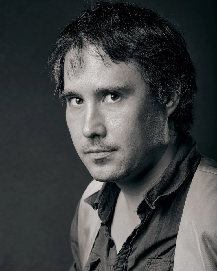
^(Where soft light has a more gentle gradient in the shadows than hard light, diffuse light has a more subtle gradient in the highlights than specular lighting. The difference is more subtle than hard vs. soft light, but can just as easily showcase the artistic vision of the photographer and drastically change the resulting image.)
##Specular vs. Diffuse
This is the lesser known side of lighting. It’s often confused with hard or soft light, but specularity is an independent factor from the softness of light. Just because a light is diffused does not mean it is a soft light. It is possible to diffuse a hard light source, just as it is possible to have a specular light that is also soft.
Just as the softness of a light will show in the gradient of the shadow, the specularity shows in the gradient of the highlights. More specular lights will have a hard, bright highlight while a more diffused light source will have a more even distribution between highlight and mid-tones.
To get a more specular light, you can remove the diffusion panels from a softbox or use a silver reflector over a white one. The less scattered the light, the more specular it will appear.
^(While lighting intentionally, distinct choices in lighting can be used to get a cohesive and flattering look. While this is most obvious with portraiture, the same concepts can be applied to any genre. The key is to plan the lighting you want before taking the shot, and to either shape the light to what you want or to shoot in a time-frame and location that gives that lighting.)
##Shaping Light
Now that we’ve looked at some of the different aspects of light, let’s dive into how to actually use it. The first step is to have an idea of what you want. Does your subject look better with hard or soft light? Does specular or diffuse light fit your style better? Is your subject to big to add or change the light? If you know what light you want, it’s much easier to find what you need. Even if it doesn’t look the way you want after the first shot, knowing what you want it to look like can help guide you into getting your perfect shot.
##Adding Light
The first step to shaping light is looking at where you just need more light. Do you have a single subject that needs to be well lit? Or are you shooting an event where the ambient lighting is too dim and you just need everything to get brighter to have a clean photo? And for landscape photographers, what is the feature you want to stand out?
For closer subjects, adding light can be as simple as holding up a reflector to bounce sunlight into the scene. Flash can be used to brighten a subject against a brighter background, or to illuminate a subject on a dark background. If you have multiple lights you can manually balance all the lighting in the frame.
For subjects in landscapes, this may mean you need to wait for the best weather patterns. Are the clouds making the scene too soft? Or is the lack of clouds making everything too harsh, even in the early morning or late evening? What about seasonal effects, such as the annual dust from the Sahara adding haze to North America in the late summer/early fall? While you may not be able to directly modify the light, knowing what type of light you want on the scene can make it much easier to predict when the weather forecast will line up with the type of shot you want.
With flash you have the choice to balance against ambient light or overpower it. If shooting outdoors you can adjust the power and/or distance of the flash so the exposure on the subject matches the exposure on the background, or in situations generally seen in studio you can completely overpower any ambient light. When balancing the light, the goal is generally to make it look like there’s no flash involved. When overpowering light the goal is generally to have only the flash affecting the photo, so if you were to take a shot with the same settings but the flash off the frame would be pure black.
##Subtracting Light
Without any artificial lighting you can still modify the light by restricting where it hits. Flagging an area, either to prevent light from hitting somewhere or to prevent reflections, can be a simple way to modify your lighting even if you have no control over the light source. If using flash, flags can still give you more control over exactly where and how brightly the light shows.
Adding diffusion will also reduce the overall brightness from the source, whether it’s artificial or natural light. Besides becoming softer the light will also be dimmer in comparison to the bare source.
##Setting Up
There is no “right” way to set up lights, just as there is no “right” way to frame a photo. While there are guidelines meant to help understand lighting, in the end it comes down to what you want out of the shot.
Do you want a darker photo? Flagging the background or adding more light to your subject can help. Are you after a high-key photo? Focusing more light on the background than the subject is all that’s required, how you accomplish that is individual preference. The key to both of these is pre-visualization.
With a solid concept of what you want the final product to look like, you can base your lighting decisions to match the final desired result. Whether you’re flagging sunlight, finding a location where the light is reflecting the way you want, bouncing a speedlight off a room’s ceiling, or setting up a reflective umbrella that’s taller than the average person, knowing what you want to capture will help you find the best way to capture the shot. Without the concept of how you want the final shot to look it is difficult to craft the light to match.
^(The main light that illuminates the subject is called the "key" light. While other lights may play a role in giving context to the scene, the key light is the source that lights the subject.)
##Key Light
The key light is the main light source in an image. While this is generally the light that’s on your subject, it can also be focused more on the background, placed behind the subject as a rim-light, or positioned in other ways. The location and size of your key light will be the main factor in how the overall look of the shot. An on-camera speedlight bounced off a ceiling will have a drastically different look than an off-camera speedlight behind your subject, even though both would be considered the key light for a one-light setup. The main focus of the key light is to make the subject visible within the frame. When only using one light, it’s automatically the key just by virtue of being the only source of light. With multiple lights, reflected lights, or other methods of lighting the key is the light that is directly on your subject. It doesn’t need to be the brightest of the lights used, but it’s the light that is used for the primary exposure of the subject.
##Fill Light
While the Key light in this example photo is also a rim-light, the flash is used as a fill to prevent the face of the subject for being in shadow. In this particular example the sunlight is the brightest light, but the fill from the flash allows detail to be visible in both the horse and person. When balanced well with the ambient (or key) light, it can be difficult to tell when an extra light was used. In other cases, still allows for the subject to be visible in a primarily backlit scene.
A fill is simply a light used to brighten shadows caused by the key light. When shooting outdoors a flash may be used solely as the fill to match the sunlight behind a subject. In-studio, a reflector or second flash can be used to keep the shadowed side of the subject from becoming too dark. Either way, the fill light is meant to brighten shadows and give detail that normally wouldn’t be visible.
^(Rim light highlights the back and edges of a subject, and while it is often used in conjunction with a key and fill light it can also be used on its own for a more dramatic and "film noir" style of light.)
Also called a hair light, rim-lighting is used to add highlights from behind a subject either to give separation from the background or to give more dimension to a subject. When solely using a rim light you can also get dramatic silhouettes. A rim-light can be bounced off a background to get high-key photos or simply to act as a fill light on the background.
^(Knowing what light you want for your scene can be the difference between a generically “well lit” photo and a photo that shows who you are as a photographer.)
The style of lights you choose will depend heavily on what genre you prefer to shoot. A speedlight is great for weddings or events, and can be used for studio work as well when needed. Strobes are fantastic for in-studio work, but can be cumbersome to set up and use on-location and are poorly suited to moving around. Neither one would be a good fit for landscapes, where the best option is careful planning for the light based on time of day, time of year, and weather. For street photography you may only need the on-camera flash on rare occasions, and just like with landscapes you plan your shoot based on time and weather, with the extra focus on how the buildings will affect the light in your shot. Or if you like the late ‘90s/early ’00s “candid” look, you may want to rely exclusively on the hard, direct light from the pop-up flash.
Modifying your light is just as important as the light itself, and can often have a bigger impact. It doesn’t matter the light source, if you use a large modifier you will get a very soft light with little shadow and a long gradient. Bouncing a speedlight off a ceiling will give you an even lighting that can be more effective than a softbox when you’re on the move. Using a grid or flags will keep the light focused only on the subject, allowing you to get the chiaroscuro style of Rembrandt or Vermeer (or think film-noir in movies).
While it’s a bit more obvious when a studio photographer is selecting lights and modifiers, it can also be seen in landscapes when the time and weather is specifically chosen to capture a very specific direction and style of lighting. Some photographers will plan out a location months in advance to be on-location at the perfect time. While street photography tends to be less planned, you will still see photographers choosing specific locations to shoot at different times based on how the light will be interacting with the environment.
01:35 UTC
Lesson 24: Assignment
##Practice Metering Experiment with your camera’s metering modes (Matrix/Evaluative, Center-Weighted, Spot) by photographing three different scenes: outdoor bright light, mixed indoor light, and low-light/backlit. Capture the same scene using each mode, then compare how the exposure changes. Submit three photos per scene and write a brief reflection on your experience and preferred mode.
#Take a photo.
Your photo can be of any subject, in any setting. It should be inline with your project.
Be intentional about which metering mode you are using. You should be able to recognize which and know why you chose what you did.
##Don’t forget to complete your Learning Journals!
18:37 UTC
Lesson 24: Metering Modes
^(Various lighting conditions will benefit from different metering modes. How would you meter the above photo?)
##Metering Modes Metering modes are one of the less flashy, but more vital components to consider for a proper exposure. How the camera meters the light is essential whether you’re using auto/priority modes or full manual and have an effect whether you’re shooting with a DSLR or mirrorless with live view.
The metering modes are how the light meter within the camera biases it’s reading and can make getting the correct exposure much easier once you know how they all work. For the basics though, each metering mode balances the exposure based on what part of the frame is deemed “most important” and will adjust any auto or priority modes based on that reading. There is also a meter either on the bottom or side of the viewfinder (or display) that shows where the exposure will be, with “0” (or neutral) being centered and positive (overexposed) and negative (underexposed) to either side. Usually, this meter also tells you how many stops over or under exposed the image will be.
##Standard While cameras now come with multiple modes, most still have the basic metering of measuring all the light in the scene. This mode, while it has different names depending on the camera manufacturer, has no bias or interpretation and simply reads the light from the full scene. Everything is averaged out, and any calculations on brightness are based on the overall light across the entire frame.
##Matrix/Evaluative In this mode, the camera is still evaluating brightness across the frame but is also judging the scene based on where those bright and dark areas are. It will make a decision based on how the frame is arrayed as to what it thinks is the best exposure for the type of scene you’re shooting. For the most part this mode is fairly effective, it’s becoming the default on many cameras, and will give fairly consistent results for most photography. Matrix mode still evaluates brightness across the entire frame but will bias any priority modes based on where the brightest and darkest parts are. So, if you have a really bright sky taking up most of the frame but the subject is in shadow, such as for backlit portraits, it will suggest the exposure to keep the subject visible instead of just an average.
##Center Weighted Center-weighted metering focuses on the light just from the middle of the frame. While this can be problematic for landscapes, where the areas you want brightest aren’t usually centered, it can be incredibly helpful for faster paced genres where you want the subject exposed properly and the background is less important. This is also a great mode if you plan to use the Auto Exposure Lock (AE-L) while shooting. This will let you provide the camera with a specific input for exposure and then recompose the image without the camera changing settings on you.
##Spot This mode is best used with smaller subjects, distinct differences between bright and dark areas, and is perfect when using AE-L. It’s similar to center-weighted metering, but even more focused on a smaller area within the frame. This allows you to specify an exact point to measure for brightness and leaves less guesswork to the camera.
##Highlight Some cameras have a highlight priority mode, which focuses entirely on protecting the highlights in your image. This can be useful for landscapes, studio work, or any other shots where retaining as much highlight information as possible is needed. And while incredibly useful for protecting highlights, in highly dynamic scenes this can also lead to loss of detail in the shadows.
##Selenium Cell So far, we have discussed metering modes on modern cameras. For older cameras there are also a few variations, but they essentially function the same as the selenium cell, so that’s what we will cover. Selenium is a light sensitive mineral that produces an electric current dependent on the amount of light that hits it. Because the fluctuation in the current is constant to the amount of light it's exposed to, this allows the camera to give a reading based on the available light even for cameras that have no electrical components. The issue that can arise it that it’s dependent on the light hitting the camera, not the scene. If you are standing in brighter light while your subject is in a shaded area the meter reading will give you an underexposed frame, or vice-versa if you’re in the shade and your subject is in brighter light.
##Handheld Light Meters While all modern cameras, and most functioning film cameras, have some sort of light meter built in there are also handheld light meters available. While these are mostly irrelevant to modern photography it can still be important to understand their function.
##Incident Readings Incident metering is how the selenium meter functions and is more useful off-camera than it is on-camera. Having a handheld meter allows you to measure the light at the subject, instead of at the camera. This is incredibly useful in portraiture where you’re trying to meter off the subject’s face, as it doesn’t matter how the rest of the scene is lit if you take the reading from where the subject will be standing.
##Spot Readings This functions the same as spot metering in-camera, where the meter looks at the light from a specific point in the scene to determine the optimal exposure.
##Flash Some (more expensive) handheld meters allow incident readings based on the output of strobes or flash. This can be helpful even with modern gear as it can eliminate test shots to dial in exposure. While not essential if you’re using a digital camera, for using strobes with analog gear it is absolutely needed if you don’t have a digital camera available to dial in exposure.
##Metering in Manual While metering modes will adjust settings for you if you’re in an auto or priority mode, it will still give you a reading even if you’re shooting fully manual. While it doesn’t change any of your settings, it will give you an estimate of whether your shot will be over or under exposed before you press the shutter. With a DSLR this will be the only way you have to monitor exposure when looking through the optical viewfinder, so knowing how your camera is metering the scene is incredibly important.
With mirrorless cameras, or when using the live feed on the back screen of a DSLR, you will get a preview of the scene but depending on the screen’s brightness and the ambient light it can give a false sense of the exposure. Knowing the metering mode can still help with ensuring the screen’s brightness isn’t giving you a false sense of brightness as you shoot.
##Exposure Compensation When using auto or a priority mode, you can also use the exposure compensation dial to fine tune how the final image will turn out. This can be either a physical dial or a function button that allows you to adjust whether the camera will intentionally over or under expose based on the meter’s reading.
This is useful for when the camera isn’t getting the exact exposure you’d like, but there are still too many changing variables to go fully manual. It can also be useful in a priority mode just to fit consistently with your preferred style.
##Reading your Histogram One feature of mirrorless cameras (and some DSLRs in live view) is the ability to see the histogram before you take a shot. Although the histogram is generally a feature used while editing, if you have access to it while shooting it can be a useful tool to judge your exposure prior to shooting.
The far right of the histogram is the white point while the far left is the black point, and the vertical axis shows how many pixels are at that brightness level. Just like with adjusting exposure in post, adjustments in camera will affect how the histogram looks. If you overexpose, the lines of the histogram will be pressed against the far right. If underexposed, they will be at the far left.
Sometimes though, you will want a mostly under or overexposed shot. The histogram will look unbalanced but can be helpful for figuring out exactly what’s going on. For example, with a low-key portrait the majority of the photo will be dark or completely black. If the histogram shows the largest grouping in the middle, then there may be an issue with keeping light off the background. And for a high-key photo, a “balanced” histogram can indicate that there isn’t enough light on the background. Using this to help dial in a photo before you press the shutter can speed up your workflow considerably without relying on finding out in post how bright or dark your shot really is.
For cameras that don’t have a live histogram, this is another area where spot metering will shine. It can allow for proper exposure on your subject while ignoring the areas you want intentionally bright or dark.
##Conclusion Each of these metering modes has its benefits, and each its limitations. The key to using them is the intention with the style you shoot with and the context of the scene you’re in. You may find yourself using primarily one mode for the majority of your work but having the knowledge of when to change modes can help with difficult lighting, unusual conditions, or even simply trying something new and finding the most effective way to capture it.
18:36 UTC
Lesson 23: Assignment
##Choose intentionally.
For the remainder of the assignments, we’re asking you to work on your project. That means all the assignments should be done with your project in mind. Don’t feel like you have to end up using all the images in your final project, but they are available for that if you decide to.
##Take a Photo.
Your photo can be of any subject, in any setting. It should be inline with your project.
Be intentional about which focus mode you are using. If you’re using autofocus, be intentional and know which mode you used and what focus point(s) you used. You should be able to recognize which and know why you chose what you did.
##Don’t forget to complete your Learning Journals!
16:24 UTC
Lesson 23: Auto & Manual Focus
#Autofocus
^(Choosing the right focus mode will make your life as a photographer endlessly easier. Looking at the above photo, what do you think would have been the best choice: auto or manual focus?)
By now, you are likely familiar with focusing your camera. It’s simple, right? Half-press the shutter release, the camera focuses, and then finish pressing the button to fire the shutter. And honestly that really is the basics of it.
There’s a lot more to focusing though, and while it’s not essential to simply taking a photo the knowledge can be incredibly helpful in speeding up your workflow and getting more functionality from your gear. Between the various focusing modes and types of autofocus there are a number of factors you can leverage to improve your photos if you understand the differences and limitations of each. So, to begin:
##Phase Detect vs. Contrast
There have been different ways that autofocus has worked over the years, and the primary methods have been contrast detection and phase detection. Contrast detection is fairly self-explanatory: the camera detects areas of high contrast and shifts the focus until that area has the sharpest boundary between areas as possible.
With Phase Detect, it functions more similar to a rangefinder. The light from the edges of the lens are picked up by separate sensors multiple focusing sensors are incorporated into the imaging sensor) and when they converge they are considered “in focus”
So what does this mean?
In short, cameras with Contrast Detect autofocus are going to focus on areas of high contrast. If you try and focus on areas of lower contrast then the sensor will struggle to find focus, whether it’s due to similar lighting, low-light, or just a general lack of variance in the light’s contrast. With Phase Detect, it can be faster and more reliable as it’s lining up the areas of contrast, not judging purely on how much contrast there is. It will still struggle in low-light or when there’s not enough variation in light, but is generally faster and more reliable.
##Autofocus Modes
There are also differences in how the camera applies the focus. The biggest difference, one that almost all cameras apply, is continuous focus vs. single focus (AI servo vs. One Shot for Canon users) These are the main concerns when shooting, as each has distinct advantages and are both available across camera systems.
Single Focus (One-Shot): This is the standard mode for digital cameras, and easily the more commonly used mode. Essentially, when your camera focuses in this mode it will find the focus and then hold that focus until either the photo is taken or the shutter is released completely and focusing is began again. This mode is incredibly useful for still subjects, focus-and-recompose (which will be covered more shortly), and most general use.
Continuous Focus (AI Servo): This mode isn’t great for still subjects, as it allows the camera to continue to change focus until the shutter is fully depressed. What it does excel at is focusing on moving subjects. As the camera continually adjusts its focus up to the point where the shutter is triggered, it will track moving subjects through the frame. Whether your subject is pets, children, athletes, or other fast moving subjects this mode can allow your camera to keep the subject in sharp focus.
Eye, Face, and Tracking: Many cameras within the past decade have implemented focusing on a subject’s face or even their eyes, and they have improved detection for both people and animal faces. While for the most part this doesn’t change anything about the focus mode used it will allow for a more precise focus without the need to adjust the focus point manually. This is helpful for subjects that are in motion, but also is a fantastic resource for subjects that may move suddenly and quickly. There are absolutely methods to get precise focus on a still subject, but if your subject is moving or likely to move if you take too long to focus then using the face/eye tracking can help acquire focus quickly and consistently.
Manual Focus (with an autofocus lens): This is a bit generally unused simply because it usually doesn’t make sense to focus manually if you have autofocus available. There are times, however, where slight manual adjustments can make the difference between “good enough” and “perfect.”
Usually, you will not be able to focus manually if autofocus is enabled. It requires a dive into the menu to make it work. And in most situations it’s completely unnecessary, which is why it is defaulted on many cameras to not be allowed without digging through menus. There are times though where you may want to use autofocus but it doesn’t quite focus where you want. If there’s a high-contrast area right beside where you want the camera to focus, if the subject isn’t perfectly still while the camera autofocuses, or if the focus isn’t perfect while using focus-and-recompose, then the ability to manually adjust can help.
Back Button Focus: This feature is usually either loved or hated, but either way it’s a focusing mode that’s worth knowing about. Essentially, it decouples the focusing from the shutter button and maps it to a different button on the camera. For faster-paced photography such as sports or pets it’s generally less effective, but can still be used when pre-focusing on an area to capture any action as it comes into a pre-decided spot. It’s also fairly common among landscape photographers as it allows the photographer to set their focus before fine-tuning the composition. It will allow the focus to be set without needing to worry about the camera re-focusing when going to take the shot. It functions basically the same as using the autofocus-lock (AF-L) but without needing to hold the button to keep the focus constant.
Most cameras require setting up back button focus through the menu system, but there are some that will allow for back button focus simply by switching the camera’s focusing mode to manual. In those cases, the default focusing button is typically the AF-L. In these cameras it’s much faster to switch between back button and standard autofocus, but in the end the effect is the same. It’s worth trying out, and if it’s something you prefer to use then it’s not likely you will be changing back and forth often anyway.
^(Once you’ve decided to use auto mode, making sure you’re on the best autofocus mode and using the right focus points means the difference between missing focus and a sharp photo where you want it to be sharp.)
##Focusing Motors
Getting back to the gear side of things, aside from the camera body’s focusing capabilities the lens also plays an essential role. There are a number of different motor types that each have their advantages, whether in cost and size or speed and silence. While it’s important to consider the performance of a lens before making a purchase, it’s more important to understand the limitations of the gear you currently have. For example, a stepping motor will generally be quick to focus but may seem to “jump” as opposed to a silent wave/ultrasonic motor which tend to be smoother and nearly silent (but also expensive and need a larger lens housing).
When buying a new lens its focusing motor can be nearly as important as cost, but for the most part it’s better to learn how to work within (and overcome) any limitations of the gear you already have. Slower motors may require a bit more pre-planning if shooting faster action, and louder motors may be more difficult to use if shooting close up video with on-camera audio or a mic that’s close enough to pick up the sound.
##Putting it All Together
Knowing when to use different autofocus modes, or to focus manually, can have a major impact on achieving better focus during a shoot. Having the experience with your gear to know what works best with your workflow can be the key to nailing focus in otherwise challenging situations. While it’s likely you won’t switch constantly through modes as you shoot, knowing the modes and which methods benefit your style can lead to working faster, more accurately, and overall can give you more confidence in the techniques you’re using.
##Focus Points
While fairly explanatory, it’s still worth covering how to use focus points to your advantage. Depending on the camera, you can shift where in the frame it will grab focus through either moving the point with a toggle/joystick, buttons, or by tapping on the back LCD screen. Setting this will let you frame your subject how you prefer without needing to move the camera around just to get focus. This works great with more mobile subjects where you may not have time to reframe a shot once the camera is focused. It’s also useful in pre-focusing, where you can compose your shot and then wait for your subject to move into frame.
##Focus and Recompose
Again, the term is self-explanatory. Using this method involves focusing the camera and then framing your composition before firing the shutter. It can be useful for relatively static subjects where you may be moving around more, or for rapidly changing scenes where you don’t have time to change focusing points between shots.
##Auto + Manual Focus
This method tends to be used for static scenes where perfection is desired. Sometimes the autofocus gets close, but the exact point you’d like to focus doesn’t have enough contrast for the focus to be perfect. Or you get focus and then the subject moves slightly closer or farther. Either way, it can sometimes be easier to let the autofocus get “close enough” and then tweak the focus manually to get it perfect. The downside to this method is the fact that it’s much slower, but it does allow for more precision.
###Manual Focus
^(The above photo was taken with an old manual film lens (Helios 44-2) adapted to a Fujifilm X-T10.)
Autofocus technology has advanced significantly and, in most situations, will outperform a photographer’s ability to manually focus. For stills photography, relying on AF allows you to work faster and more efficiently, especially in fast-moving environments like street photography, sports, or wildlife, where precision and speed are key.
However, there are notable exceptions where manual focus becomes advantageous or necessary. In low light, such as when capturing the night sky in astrophotography, AF may struggle to lock onto a subject. Similarly, when shooting macro photography, where depth of field is razor-thin, manual focus gives you greater control over exactly what part of the subject is sharp.
Tilt-shift lenses, often used in architectural photography, require manual focus because of the unique way they manipulate the plane of focus. Budget lenses, which may have slower or less accurate AF systems, might also benefit from manual focus to achieve the sharpest results. Lastly, in video work, manual focus is often used to maintain consistent focus during movement, ensuring smooth transitions that autofocus can’t always guarantee.
Understanding when to switch from autofocus to manual focus can help you navigate a variety of challenging shooting conditions and produce sharper, more intentional results.
##Using manual focus
Manual focus film cameras often included built-in focusing aids in the optical viewfinder to assist photographers in achieving sharp focus with greater speed and precision. These aids were crucial in the era before autofocus systems, allowing photographers to work confidently, even in fast-paced or challenging conditions.
One common focusing aid was the split-image rangefinder, which displayed a split view of the subject in the center of the viewfinder. When the subject was in focus, the two halves of the image would align, indicating sharpness. Another popular tool was the microprism ring, which surrounded the split-image area. When out of focus, the microprism would cause the subject to appear blurry or shimmer, and once the focus was correct, the shimmering would disappear, providing a clear signal of sharpness.
These focusing aids were particularly useful in fast-moving environments like street photography or portraiture, where achieving precise focus was critical to capturing a fleeting moment. Though autofocus has largely replaced these manual methods, many photographers still appreciate the tactile and deliberate nature of manual focusing with these aids, especially in classic or vintage cameras.
##SLR Manual focusing demo
The following video demonstrates how the manual focus works on an older SLR (Minolta X-700 - my personal favorite SLR). Video source: @ttcalan
##Low Light
Your camera’s autofocus system relies heavily on the available light to detect contrast and lock onto a subject. It needs a certain level of brightness and contrast to perform efficiently. In well-lit environments, autofocus works quickly and accurately because the camera can easily detect differences in light and shadow, allowing it to pinpoint the subject and lock focus.
However, in low-light situations, the camera’s autofocus may struggle or fail to work entirely. This happens because there isn’t enough contrast for the autofocus system to differentiate between the subject and the background. As a result, the camera may hunt for focus, continually moving the lens back and forth without finding a clear point to lock onto. You might notice this in dimly lit rooms, at night, or during events like concerts, where artificial or uneven lighting complicates focus detection.
In extreme low-light scenarios—such as when shooting at dusk, indoors without adequate lighting, or in environments like astrophotography—autofocus may be so inconsistent that manual focus becomes necessary. Some cameras have features like an autofocus assist beam or the option to switch to higher-sensitivity AF modes, but even these have their limitations.
When you encounter poor autofocus performance in low light, switching to manual focus gives you complete control over where to set your focal point, ensuring that your subject remains sharp despite the challenging lighting conditions.
##100% Magnification Live View
In challenging focus situations, like astrophotography or macro photography, using your camera’s Live View at 100% magnification can be a game-changer. When you enable Live View and zoom in on your subject, it allows you to fine-tune your focus with much greater precision than using the optical viewfinder alone. This feature is particularly helpful in low-light scenarios or when working with shallow depth of field, where even slight focus errors can be noticeable. By zooming in to 100% magnification, you can manually adjust focus until your subject is perfectly sharp, ensuring accuracy that’s hard to achieve otherwise.
When working in macro, keep in mind that as magnification increases, usable depth of field quickly shrinks. When taking macro photos, the plane of sharp focus is very thin, often a couple of millimeters. Generally, a human operator makes better use of that narrow DoF.
##Bahtinov Mask
A Bahtinov mask is a popular focusing tool used in astrophotography to achieve precise focus on stars and other celestial objects. It’s a physical mask that fits over the front of your lens or telescope and creates a diffraction pattern when pointed at a bright star. This pattern produces three distinct spikes, and when the middle spike is perfectly centered between the other two, your focus is spot on. Once focus is achieved, you can remove the mask and proceed with your exposures. The Bahtinov mask is widely regarded for its simplicity and effectiveness, allowing even beginners to achieve sharp focus in the challenging conditions of night sky photography.
##Tilt Shift
Tilt-shift lenses provide a unique way to manipulate both focus and perspective through manual control, making them valuable tools for specialized photography genres like architecture, landscapes, and product photography. Unlike regular lenses, tilt-shift lenses offer two key adjustments: tilt and shift, each serving a distinct purpose.
The tilt function adjusts the plane of focus by tilting the lens relative to the camera’s sensor. This allows you to manipulate depth of field more creatively than with a standard lens. You can achieve either an extended focus range, keeping both foreground and background elements sharp, or a selective shallow depth of field to emphasize specific parts of your image, often creating a “miniature effect.” This is particularly useful in product or landscape photography where controlling focus across different planes can be challenging.
The shift function, on the other hand, is used to correct perspective distortion, which is especially helpful in architectural photography. When photographing tall buildings, for example, vertical lines can appear to converge if you angle your camera upward. The shift function moves the lens independently from the camera body, ensuring that vertical lines remain straight, providing a more accurate and professional representation of the scene .
One key aspect of tilt-shift photography is that it’s entirely manual focus, requiring a more deliberate, slowed-down approach to composition. Mastering this technique takes practice, and many photographers find it beneficial to use a sturdy tripod to maintain precise control while making adjustments.
Additional reading on tilt shift:
##Budget Lenses
If you can work without autofocus, there are several budget-friendly options for expanding your lens collection, and adapting older lenses is one of the most popular approaches.
##Adapting Film-Era Lenses
Many photographers turn to vintage lenses from the film era, which can be easily adapted to modern digital cameras. These lenses, often made with high-quality glass and craftsmanship, are widely available and significantly cheaper than modern equivalents. Adapters for mounting old lenses onto digital bodies are affordable and can open up a whole new world of creative possibilities. With decades of lens production from brands like Canon, Nikon, Pentax, and Minolta, you can find lenses in every focal length, aperture, and style, from portrait primes to telephoto zooms.
The process is relatively straightforward for many camera systems, especially mirrorless cameras, which are particularly adaptable due to their short flange distance. The only downside is the manual nature of these lenses—they lack autofocus, and you’ll also need to adjust the aperture manually in many cases. However, for those who enjoy a more hands-on approach to photography, the tactile experience and control offered by these lenses can be very satisfying .
##Budget-Friendly Third-Party Lenses
In addition to vintage lenses, third-party manufacturers like Samyang (also known as Rokinon in some regions) produce manual focus lenses at a fraction of the cost of autofocus models. These modern manual lenses are often designed for niche uses, like astrophotography or portraits, where autofocus isn’t always necessary. They deliver high image quality at a lower price because they eliminate the electronics required for autofocus, making them an attractive option for budget-conscious photographers .
16:23 UTC
End of Summer Check-In
13:14 UTC
SEMESTER BREAK
^(Break: a time to detox, reflect, play catch-up, and practice.)
We’ve come to our semester break - somethingsomething how time flies somethingsomething. First off, congratulations on making it this far! You should be very proud that you have been able to stick with this course for 23 lessons. Now that we’re taking a break for a summer, it’s a perfect opportunity for you to start focusing on your long-term project, or if you skipped some lessons, get caught up. Remember, just because there won’t be a new lesson each week, you’re not alone. The discord is still there for you, and you can still join a peer group (click this link to sign up) to have a cohort of accountability friends. In addition, you’ll find a list below of some photography exercises that you can do to keep your skills progressing throughout the next few months. We’re also going to ask for your feedback on the course thus far. Please fill out this feedback form - be honest - we’ll be using it as a metric for the upcoming semester, and next year’s course.
#Semester Break Exercises
To keep those photography and creativity gears turning during our time off, here’s a list of some photography exercises. Do not feel like you need to do them all, they’re here for you on days when you’re feeling stuck or uninspired. You can also check in on the 52 Weeks challenge for additional support.
#Constrained Shooting Exercises
Constrained shooting is an excellent way to work on your photography skills. By removing certain variables and focusing on specific limitations, you can sharpen your creativity and problem-solving abilities. These constraints force you to think more critically about composition, lighting, and subject matter, encouraging you to explore new perspectives and techniques. This method of practice helps to develop a deeper understanding of your equipment and its capabilities, ultimately making you a more versatile and skilled photographer. Here are some constrained shooting exercises to try out for yourself:
- One Hour, One Block: Spend an hour photographing within a single city block.
- Single Lens Day: Use only one fixed lens for all your shots in a day.
- Fixed Focal Length: Shoot all your photos at a single focal length.
- One Object Challenge: Choose one object and photograph it in 10 different ways.
- Black and White Only: Shoot exclusively in black and white.
- 24 Shots, No Deletions: Limit yourself to 24 shots (like a roll of film) and don't delete any.
- Single Aperture: Use the same aperture setting for all your photos.
- No Zooming: Use only the zoom you get by physically moving closer to or further from your subject.
- Only Vertical Shots: Take all your photos in portrait orientation.
- Single Subject: Choose one subject and focus all your shots on it for a day.
- One Color Dominance: Photograph scenes where one color dominates.
- Fixed ISO: Set your camera to a single ISO and keep it there.
- Low Angle Only: Shoot all your photos from a low angle.
- No Post-Processing: Take photos that you won’t edit afterward.
- Single Location: Spend an entire shoot session in one location without moving.
- One Light Source: Use only one light source for all your shots.
- Manual Focus Only: Use only manual focus for your entire shoot.
- Reflection Only: Capture only reflections in various surfaces.
- Only Shadows: Focus exclusively on capturing shadows.
- Single Shutter Speed: Use only one shutter speed for all your shots.
- Minimalist Shots: Create images with minimal elements.
- Single Lens Filter: Use the same lens filter for all your photos.
- One Prop: Incorporate a single prop in all your images.
- Fixed White Balance: Set your camera to one white balance setting and keep it there.
- Double Exposure: Create a series of double exposures.
- One Theme: Choose a theme (e.g., happiness, solitude) and stick to it.
- Slow Shutter Only: Use long exposures for all your photos.
- Daytime Silhouettes: Capture only silhouettes during daylight.
- Low Key Photography: Focus on creating low-key (dark) images.
- One Time of Day: Shoot all your photos during a specific time of day (e.g., golden hour).
- Single Color Backgrounds: Use backgrounds of a single color for all your photos.
- Textures Only: Focus on capturing different textures.
- No Autofocus: Turn off autofocus and manually adjust for every shot.
- One Camera Setting: Use a single camera mode (e.g., aperture priority) for all your shots.
- Monochromatic Scenes: Shoot scenes that are predominantly one color.
- Environmental Portraits: Take portraits in a single type of environment.
- In-Camera Effects: Use only in-camera effects for creative shots.
- No Flash: Avoid using flash for all your photos.
- High Angle Only: Capture all your photos from a high angle.
- Through an Object: Shoot all your photos through another object (e.g., a glass, window).
- One Lens Attachment: Use only one type of lens attachment (e.g., macro lens).
- Same Subject, Different Times: Photograph the same subject at different times of the day.
- Zoom Lens at Fixed Focal Length: Use a zoom lens but keep it at a fixed focal length.
- Single Aspect Ratio: Use one aspect ratio (e.g., 1:1, 16:9) for all your shots.
- One Background: Use the same background for all your photos.
- Only Natural Light: Use only available natural light.
- Long Exposure Day: Use long exposures for every shot.
- Only Manual Settings: Shoot entirely in manual mode.
- Same Frame Composition: Keep the same frame composition for all your photos.
- Fixed Perspective: Shoot all your photos from the same perspective (e.g., eye level, bird's eye).
#General Photography Exercises
While constrained shooting is a great way to challenge yourself, there are plenty of more open photography exercises which will also give you some focus and direction. These exercises can encourage experimentation and exploration while still providing a framework to guide your creativity. Open exercises allow for more flexibility and personal expression, helping you to discover your unique style and voice as a photographer. Here are some ideas:
- Write your name in photos - find each letter of your name, or objects that can be creatively framed to look like a letter in your name. Edit them together to write it out.
- Choose a shape (circle, square, triangle) and photograph objects that fit that shape.
- Photograph the same location at different times of the day to capture varying light conditions.
- Make a series of images showcasing different textures (smooth, rough, soft, hard).
- Photograph reflections found in puddles, mirrors, windows, etc.
- Photograph objects that create a gradient of colors when placed together.
- Experiment with long exposures to capture motion blur in a scene.
- Photograph your subject through another object (e.g., through a glass, a hole, or a fence).
- Experiment with macro or extreme close-ups of objects to highlight their fine details.
- Find and photograph symmetrical scenes or objects.
- Take photos of subjects in silhouette against a bright background.
- Use natural or man-made frames (like windows or arches) to frame your subject within the photo.
- Create photos that play with perspective to make subjects appear larger or smaller than they are.
- Take portraits of people reflected in various surfaces.
- Experiment with creating double exposure photos either in-camera or through editing.
- Photograph scenes or objects that subtly resemble human faces.
- Photograph small objects to make them appear monumental.
- Photograph a single subject from multiple angles and perspectives.
#Next Steps
We’ll be returning to the course in September. Until then, work on your long-term project when time allows, try out some of the above exercises, and maintain activity with your peers in the discord. We’ll try and have regular meet-ups throughout the next few months, so check in on events in the discord, and we’ll pick up with the next lesson September 2, 2024! Have a good break!
11:33 UTC
Lesson 22: Assignment
##Make a Plan. Make a Photo.
For this week we want you to make a plan for your final project. Remember that any planning you do is living, meaning it can change and evolve throughout the duration of your project. The plan you make this week does not have to be comprehensive, it is just to get you started with the process.
As we’re at the end of this semester, your photo for this week is going to be completely open-ended. Just make a photo! Any photo! The important thing is to have fun with it. With the photo, include what kind of feedback you’re looking for.
##Don’t forget to complete your Learning Journals!
11:12 UTC
Lesson 22: Beginning a Project
^(Selfies Across Europe was a personal project I started in 2015. Its intent was to showcase the shift in how we travel and how we share our travels. The project ended up written about in numerous publications worldwide, and there were a lot of strong feelings about it. My initial intent was often overlooked, and photos taken out of context, but that is a risk an artist takes when sharing their projects. While it's important to be clear in our intent, remember that it may not always translate and consumers of your art may interpret it differently. If you're interested in my approach to this project, this interview best describes my mindset and intentions with the project. Note: it's in French, so google translate may be your friend. https://www.konbini.com/arts/compte-compile-photos-touristes-selfies/)
###Revisit of Brainstorming and Planning
This week is a continuation of last week’s lesson. It’s also the last lesson of the ‘semester.’ That’s right! You’ve made it halfway through the course. Pat yourself on the back, and take pride in the fact that you’ve managed to stick with it this long! Before we step into our summer (or winter, for our Southern Hemisphere friends) break, let’s discuss next steps.
Last week you started brainstorming your personal project. We tried to make it very clear that what you did last week may be, but doesn’t have to be, the framework for your final project. Planning personal projects takes time, and it’s unreasonable to expect that you were able to do it all in one week. Your assignment from last week was just to get you thinking about the entire process and move the mindset from week-to-week assignments to long term projects. What that means is that you may need to do the process again. In fact, we’d expect that you would do it again. The time during the summer/winter break is to give you the opportunity to really think about and work on your project.
###Beginning Your Project
With all that said, let’s assume that you went through the brainstorming and storyboarding process, and came out on the other side with an idea and a course of action. Now it’s time to implement those ideas. When diving into a long-term project, you should think of yourself as the Project Manager. Of course, you’re every other role, as well, but putting on that PM hat will set you up to approach the project in an organized way, which will ultimately allow you to focus on the photography when the time comes.
###Step-by-Step Plan for Your Project
Define Clear Objectives: Establish what you aim to achieve with your project. Are you focusing on a particular theme, technique, or subject matter? Write down your goals and what success looks like to you.
Create a Timeline: Break down your project into manageable phases. Set deadlines for each phase to keep yourself on track. This could include research, shooting, editing, and final presentation.
Gather Resources: List the equipment and materials you’ll need. Consider any additional items like props, lighting, or software you may need.
Scout Locations: If your project involves specific locations, plan visits to scout them out. Take note of the lighting conditions, possible angles, and any logistical considerations. I find it helps to document the scene when scouting. I’ll often just take dozens of shots of the entire space with my phone as reference photos. Be sure to note the time of day you were there as well as the weather conditions.
Build a Shot List: Outline the specific shots you need to capture to fulfill your project’s objectives. This will help you stay focused and organized during the shooting phase.
Plan for Contingencies: Consider potential challenges and how you’ll address them. This could include weather conditions, equipment failure, or scheduling conflicts.
###Implementing Your Plan
Now that you’ve laid the groundwork, it’s time to start executing your plan. It can be difficult to stay on track, especially when a project spans a long period of time. To keep yourself focused, try to do the following:
Stay Organized: Keep all your notes, shot lists, and schedules in one place. If you’re an analog-type person, grab a new notebook and use it only for your project. There are also loads of apps to help you stay organized. Some project management apps include: Trello, Asana, and Notion. Popular note taking apps include: Evernote, OneNote, and Google Keep. Task management apps include: Todoist, Microsoft To Do, and Any Do. Calendar apps are also useful and you probably already have an efficient one on your phone.
Regular Check-ins: We will have regular check-in meetings on the discord where you can share your progress with teachers, mentors, and peers. I would also suggest teaming up with one peer to keep yourself motivated and on track. You can also just check-in with yourself. Adjust your plan as necessary based on what’s working and what’s not.
Stay Inspired: Keep your creative juices flowing by seeking inspiration from other photographers, art, or nature. Don’t be afraid to pivot if a new idea excites you more than your original plan. Your brainstorming can always be revisited as a baseline for your process.
Seek Feedback: Share your work with peers or mentors throughout the process. Constructive feedback can provide new insights and help you improve your project. We will also have regular feedback sessions throughout the summer and remainder of the year.
###Finalizing Your Project
As you near the end of your project, begin to think about how you will present your work. Keep in mind that you have until the end of the year to finish your project. This is not something we expect you to be actively engaged in just yet. We’re talking about it now just so you have all your resources together in one place, and can come back to it as a reference point. When thinking about finalizing the project, consider the following:
Culling and Post Processing: Later in the year we will go more in depth about culling and making sure you’re presenting your best work in the manner in which you intend. To make your life easier later on, when importing photos for your project, go through and label ones which you’re considering for your final project. Culling in smaller batches makes it less daunting later on. Just keep in mind that months down the road, your project may have taken a turn and some of the photos your disregarded earlier on may fit your new scope. Be open to revisiting and re-analyzing your culls. When you get to the post processing step, approach it from a holistic perspective, thinking of the project as a whole, and not individual photos. This doesn’t mean slapping on the same preset and calling it a day, it means being open to different approaches for each photo in order to draw attention to the cohesion of the project.
Presentation: Decide how you want to showcase your project. This could be an online portfolio, a physical photo book, a zine, an exhibition, et cetera. When considering how you’d like to present, think about who you want your audience to be and how you want them to consume your work.
Reflection: Reflect on your process and what you’ve learned. During the summer, jot down learns and challenges in your learning journal. Documenting this can be valuable for your personal growth and future projects, as well as making final decisions when it comes to which photos you’ll present and how.
By going through these processes and revisiting them regularly, you should be able to remain on track for your final project. Remember to regularly check in with yourself and your peers.
If you are interested in being in a peer group, fill out this form. Peer groups will be smaller groups of other participants. You will have private discord channels where you can have regular voice meetings or just keep each other accountable and share feedback. It’s a great way to have other photographers to bounce ideas off of and stay on track. Keep in mind that peer groups will be organized through discord, so if you’re not in the discord server yet, it’s best that you join it. Here is an invite link.
Next week we will address how the summer will play out logistically and set you up with a set of exercises that you can complete during the time off.
11:11 UTC
Lesson 21: Assignment
##Brainstorm. Storyboard. Make a Photo.
Think of this as a trial of preparing for your long term project. We want you to do a mini-prep. Go through the steps outlined in this lesson, and see what you come up with. This doesn’t have to be your end project, it can be, but you still have time to commit to something else if inspiration strikes. Once you’ve brainstormed and storyboarded, take one photo which fits the theme or idea you came up with. If you’re comfortable sharing your mind maps and storyboards, include those in your submission. Include a write-up of your process and how the image works within your theme.
##Don’t forget to complete your Learning Journals!
17:06 UTC
Lesson 21: Brainstorming & Planning
^(Personal projects can come from various motivations. The above photo was taken one random sick day in Spring 2015 when I was feeling run down and stripped of all creative freedom. I decided in that moment to start a 365 day self portrait project. I set specific goals and limitations which I committed to for the remainder of the year. The planning set me up for success -- aside from the fact that I forgot 2016 was a leap year and it turned into a 366 day project. Best laid plans.)
##Starting a Personal Photography Project
As you know, we will be asking you all to complete a long-term personal project in this course. Over the past 20 weeks you’ve tried new techniques, explored different genres, and most importantly got some real hands-on experience. In the previous assignments we’ve asked you to think critically about your own work, what challenges you, and what you genuinely enjoy doing. That will be the basis of your personal project. We’ll start with brainstorming and planning out how to best approach your chosen idea.
##Why Personal Projects Matter
Personal projects are your chance to focus your creative energy into something that matters to you without the recourse of client input, forced deadlines, thematic limitations, et cetera. They are a rewarding experience with numerous benefits such as…
Creative Exploration:
They allow you to explore new themes, techniques, and styles without the constraints of client work. They also allow you to make endless mistakes, which often lead to discovering new techniques or interests. When working on a long-term project, you’ll find that you’ll see a visible evolution of your work from the first photo to the last. The story and cohesion you create within the project will help you to understand your strengths and creative objectives.
Skill Development:
Working on a long-term project helps you hone your skills and deepen your understanding of your chosen subject. You may find that you have a final image in mind, but aren’t sure how to achieve it. The flexibility of a personal project gives you ample opportunity to continue learning and trying new things, which will ultimately increase your skill level across the board.
Portfolio Building:
A well-executed personal project can enhance your portfolio, showcasing your creativity and commitment. Whether or not you’re interested in making photography anything other than a hobby, having a portfolio is rewarding. Even if you don’t share your portfolio, having a selected body of work for your own reference brings pride in your own achievements. A personal project is a wonderful basis for a strong portfolio.
##Brainstorming Ideas
Identify Your Interests:
Start by listing topics, themes, or subjects that genuinely interest you. These could be anything from street photography, nature, portraits, or abstract concepts. Reflect on the assignments from the previous weeks - were there any which resonated with you more than others? Is there another hobby or cause which you feel strongly about?
Research and Inspiration:
Look at the work of other photographers for inspiration. Identify what speaks to you and why. Consider how you can put your unique spin on these ideas. Remember that you can get inspiration outside photography. Look to other media for sparks.
Mind Mapping:
Create a mind map to visually organize your thoughts. Write your main idea in the center and branch out with related concepts, techniques, and potential subjects. I find that doing this is a great way to find links in your thinking, which may lead to a cohesive idea. You can also try freewriting. Set a timer for 10-15 minutes. Put pen to paper. And write. Don’t let the pen stop - it doesn’t need to be grammatical or even comprehensible. When you revisit your freewrite, you may find that your mind led you to a strong idea.
Theme Selection:
Now that you’ve considered your own interests and sought out inspiration, it’s time to choose a theme. Choose one that excites you and has enough depth to sustain a series of photographs. Ensure it aligns with your goals and interests. If you can’t narrow it down to one, workshop more than one to see if one theme or idea lends itself better to a project.
##Planning Your Project
Define Your Project Scope:
Determine the scope of your project. How many photos will it include? Remember the (soft) deadline for your final project is December 31st. Be realistic about what you can achieve within that time period.
Set Specific Goals:
Outline clear, actionable goals for your project. These could be technical (e.g., mastering a specific lighting technique) or conceptual (e.g., telling a story through images). Do these goals align with your overall goal you set at the beginning of the year?
Create a Timeline:
Develop a timeline with milestones. Break your project into smaller tasks and set deadlines for each stage. This will keep you organized and motivated. We will check in on the project throughout the remainder of the year, but setting your own timeline will allow you to realistically work it into your schedule.
Gather Resources:
Identify the resources you’ll need, such as equipment, locations, models, or props. Make a list and start gathering what you need. If you’re not sure what you’ll need, leverage the knowledge of your mentors and peers. Talking out your project with your classmates will be beneficial.
Storyboard Your Ideas:
Create a storyboard or shot list to visualize your project. Sketch out or list the key shots you want to capture. This will serve as a guide during your shoots. Don’t worry about the quality of the storyboard - it’s for you and you only, so it really only has to be decipherable for yourself.
Take the First Shot:
It’s one thing to map everything out, it’s another to actually make the first shot. I have been mapping and working on the preparatory steps of a long term project since 2016. In 2019, I finally took the first shot. The weight of my own expectations were keeping me from diving in headfirst, but after that first shoot, the project finally seemed obtainable. The photos themselves are not ones I’m particularly proud of photographically, but knowing that they were what got me out of my own head in the planning process makes them infinitely more important to the project as a whole. You can plan and mindmap and storyboard ad infinitum, but pressing that shudder for the first time makes it real. Don’t put pressure on yourself, trust your vision, and remind yourself that the project is always evolving.
17:05 UTC
Lesson 20: Assignment
###Share. Re-Do. Reflect.
##Share a Photo You're Happy With
Select a Photo: Choose one photo you’ve taken since the start of this class that you’re particularly happy with.
Write a Reflection: Comment on why you like this photo. Consider aspects such as composition, lighting, subject matter, or any specific techniques you used. What makes this photo stand out to you?
##Share a Photo You're Less Happy With and Re-Do It
Select a Photo to Improve: Choose one photo you’re less happy with. Identify what specifically you’re not satisfied with. Is it the composition, lighting, focus, or something else?
Re-Do the Photo: Take a new photo with the aim of improving on the original. Make the necessary changes to address the issues you identified.
Write a Reflection: Comment on why you chose to re-do this photo and what changes you made. How do the improvements align with your initial critique?
##Comment on Your Progress Towards Your Goals
Review Initial Goals: Reflect on the goals you set at the beginning of the class. Consider your progress towards these goals.
Write a Reflection: Discuss your progress. Have you met your goals? Are you on track? What challenges have you faced, and how have you overcome them? What achievements are you proud of?
##Set New Goals or Re-Work Initial Goals
Revisit Your Goals: Consider if your initial goals still align with your current aspirations. If needed, set new goals or re-work your existing ones to better fit your progress and interests.
Write Your Goals: Clearly outline your goals for the remainder of the class. Break them down into actionable steps to ensure they are attainable.
##Don’t forget to complete your Learning Journals!
10:31 UTC